
Journey to Web Components: From Fundamentals to Advanced UI Architecture
Lifecycle Callbacks & Component Communication
Mastering Web Components Through Lifecycle Management and Inter-Component Interaction
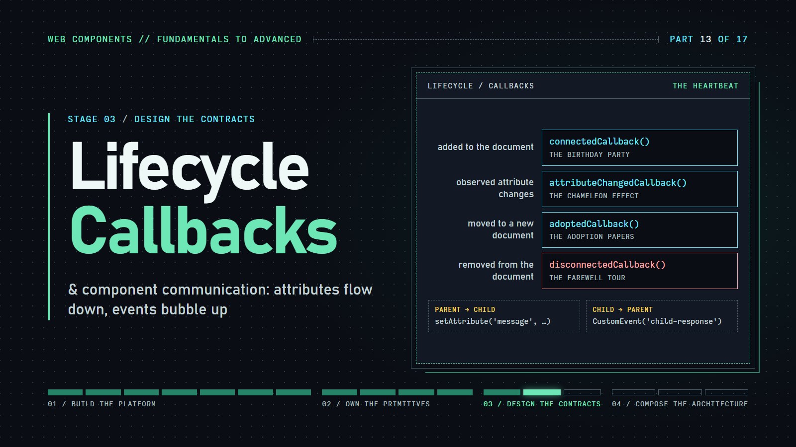
A custom element is a tag we define, and the browser tells it when something happens to it: it appeared on the page, it was removed, or one of its attributes changed. This post covers those moments (the lifecycle callbacks), then how components pass messages to each other.
Quick recap if you are joining here: a custom element is a class that extends HTMLElement, registered with customElements.define('my-tag', MyClass). Shadow DOM gives it a private inside, so the page's CSS cannot leak in or out. To keep the short snippets short, most of them write straight into the element with innerHTML and no shadow root; the live demos use Shadow DOM. (Only put text you trust into innerHTML.)
We'll cover two things:
- Lifecycle callbacks: the four hooks the browser calls on your element
- Component communication: how components share data and news
Lifecycle Callbacks: The Heartbeat of Your Components#
Imagine your Web Component as a living entity with a clear lifecycle: it's born, grows, changes, and eventually leaves the page. Each of these stages triggers specific callback methods that you can tap into:
1. connectedCallback(): The Birthday Party#
When your component joins the DOM, it's time to celebrate! This is where initialization happens:
class BirthdayComponent extends HTMLElement {
  connectedCallback() {
    console.log('🎉 I\'m alive! Time to party!');
    this.innerHTML = `
      <div class="birthday-card">
        <h2>Hello World!</h2>
        <p>I was born at ${new Date().toLocaleTimeString()}</p>
      </div>
    `;
    // Start any necessary timers, fetch data, etc.
  }
}

customElements.define('birthday-card', BirthdayComponent);
Try it yourself: Add <birthday-card></birthday-card> to your HTML and watch it come to life in the browser console!
---html
<div class="tab-content active" id="birthday-tab" role="tabpanel" aria-labelledby="tab-birthday">
        <div class="controls">
          <button id="add-birthday">Add Birthday Component</button>
          <button id="remove-all-birthday" class="remove">Remove All Birthday Components</button>
        </div>

        <div id="birthday-container" class="components-container"></div>
      </div>
---css
/* Base styles */
:root {
  /* Light mode variables */
  --bg-color: #f5f5f5;
  --text-color: #333;
  --card-bg: #fff;
  --shadow-color: rgba(0,0,0,0.1);
  --border-color: #eee;
  --highlight-color: #f0f0f0;

  /* Button colors */
  --btn-primary: #4CAF50;
  --btn-primary-hover: #45a049;
  --btn-cleanup: #2196F3;
  --btn-cleanup-hover: #0b7dda;
  --btn-mood: #9C27B0;
  --btn-mood-hover: #7B1FA2;
  --btn-remove: #f44336;
  --btn-remove-hover: #d32f2f;
  --btn-adopted: #8bc34a;
  --btn-adopted-hover: #7cb342;

  /* Console colors */
  --console-bg: #333;
  --console-text: #fff;
  --console-birthday: #FF9800;
  --console-cleanup: #2196F3;
  --console-mood: #E91E63;
  --console-adopted: #8bc34a;
  --console-communication: #4CAF50;
}

/* Dark mode variables */
@media (prefers-color-scheme: dark) {
  :root {
    --bg-color: #121212;
    --text-color: #e0e0e0;
    --card-bg: #1e1e1e;
    --shadow-color: rgba(0,0,0,0.3);
    --border-color: #333;
    --highlight-color: #2c2c2c;

    /* Adjust button colors for better contrast in dark mode */
    --btn-primary: #5CDF60;
    --btn-primary-hover: #4cd050;
    --btn-cleanup: #42a6ff;
    --btn-cleanup-hover: #3b95e5;
    --btn-mood: #bb4fd0;
    --btn-mood-hover: #a53fb8;
    --btn-remove: #ff6b60;
    --btn-remove-hover: #e55c52;
    --btn-adopted: #9bd45a;
    --btn-adopted-hover: #8bc34a;

    /* Console colors (keep high contrast) */
    --console-bg: #1a1a1a;
    --console-text: #f0f0f0;
  }
}

/* High contrast mode styles for accessibility testing */

/* Debug controls styling */

body {
  font-family: 'Segoe UI', Tahoma, Geneva, Verdana, sans-serif;
  display: flex;
  justify-content: center;
  align-items: center;
  min-height: 100vh;
  background-color: var(--bg-color);
  color: var(--text-color);
  margin: 0;
  padding: 20px;
  line-height: 1.5;
}

.controls {
  margin-bottom: 20px;
  padding: 15px;
  background-color: var(--card-bg);
  border-radius: 8px;
  box-shadow: 0 2px 4px var(--shadow-color);
  display: flex;
  flex-wrap: wrap;
  gap: 10px;
}

button {
  background-color: var(--btn-primary);
  color: white;
  border: none;
  padding: 10px 15px;
  border-radius: 4px;
  cursor: pointer;
  font-size: 16px;
  transition: background-color 0.3s, box-shadow 0.3s;
  position: relative;
}

button:focus-visible {
  outline: 3px solid #4d90fe;
  outline-offset: 2px;
}

button:hover {
  background-color: var(--btn-primary-hover);
}

button.remove {
  background-color: var(--btn-remove);
}

button.remove:hover {
  background-color: var(--btn-remove-hover);
}

#components-container {
  display: flex;
  flex-wrap: wrap;
  gap: 20px;
}

.tab {
  padding: 10px 20px;
  background-color: var(--highlight-color);
  cursor: pointer;
  border-top-left-radius: 5px;
  border-top-right-radius: 5px;
  margin-right: 5px;
  position: relative;
  outline: none;
  border: none;
  color: var(--text-color);
  transition: background-color 0.3s;
}

.tab.active {
  background-color: var(--card-bg);
  font-weight: bold;
}

.tab:hover {
  background-color: var(--card-bg);
}

.tab:focus-visible {
  box-shadow: 0 0 0 3px #4d90fe;
  z-index: 1;
}

.tab-content {
  display: none;
}

.tab-content.active {
  display: block;
}

.components-container {
  display: flex;
  flex-wrap: wrap;
  gap: 20px;
}

/* Communication tab styles */

h1, h2, h3, h4, h5, h6 {
  color: var(--text-color);
}

/* Text contrast utility classes */

/* Class for elements that need to be monitored for contrast */
---js
// Define the BirthdayComponent
export class BirthdayComponent extends HTMLElement {
  constructor() {
    super();
    this._id = Math.floor(Math.random() * 10000);
    this._colors = [
    '#FF5252', '#FF4081', '#E040FB', '#7C4DFF',
    '#536DFE', '#448AFF', '#40C4FF', '#18FFFF',
    '#64FFDA', '#69F0AE', '#B2FF59', '#EEFF41',
    '#FFFF00', '#FFD740', '#FFAB40', '#FF6E40'];

    this._color = this._colors[Math.floor(Math.random() * this._colors.length)];
    this._confetti = ['🎉', '🎈', '🎊', '✨', '🎁', '🎂', '🍰'];
  }

  connectedCallback() {
    console.log(`🎂 Birthday Component #${this._id}: I'm alive! Time to party!`);

    // Create and attach Shadow DOM
    this.attachShadow({ mode: 'open' });

    // Create the component's HTML
    this.shadowRoot.innerHTML = `
      <style>
        :host {
          display: block;
          width: 280px;
          transition: all 0.3s ease;
        }

        .birthday-card {
          background-color: ${this._color};
          border-radius: 10px;
          box-shadow: 0 4px 8px rgba(0,0,0,0.1);
          padding: 20px;
          color: white;
          text-align: center;
          position: relative;
          overflow: hidden;
          transition: transform 0.3s ease;
        }

        .birthday-card:hover {
          transform: translateY(-5px) scale(1.02);
          box-shadow: 0 6px 12px rgba(0,0,0,0.15);
        }

        h2 {
          margin-top: 0;
          font-size: 1.5em;
        }

        .confetti {
          position: absolute;
          font-size: 1.5em;
          animation: fall 3s linear infinite;
          opacity: 0;
        }

        .button {
          background-color: rgba(255, 255, 255, 0.25);
          border: none;
          color: white;
          padding: 8px 16px;
          border-radius: 20px;
          margin-top: 10px;
          cursor: pointer;
          font-weight: bold;
          transition: background-color 0.3s;
        }

        .button:hover {
          background-color: rgba(255, 255, 255, 0.4);
        }

        .remove-btn {
          position: absolute;
          top: 10px;
          right: 10px;
          background: rgba(255, 255, 255, 0.3);
          border: none;
          color: white;
          width: 24px;
          height: 24px;
          border-radius: 50%;
          font-weight: bold;
          cursor: pointer;
          display: flex;
          align-items: center;
          justify-content: center;
        }

        @keyframes fall {
          0% {
            transform: translateY(-20px);
            opacity: 1;
          }
          80% {
            opacity: 1;
          }
          100% {
            transform: translateY(300px);
            opacity: 0;
          }
        }
      </style>
      <div class="birthday-card">
        <button class="remove-btn">×</button>
        <h2>Hello World!</h2>
        <p>I was born at ${new Date().toLocaleTimeString()}</p>
        <p>Component ID: #${this._id}</p>
        <button class="button">Celebrate!</button>
      </div>
    `;

    // Add event listeners
    this.shadowRoot.querySelector('.button').addEventListener('click', () => this.celebrate());
    this.shadowRoot.querySelector('.remove-btn').addEventListener('click', () => this.remove());

    // Start our periodic activity
    this._activityInterval = setInterval(() => {
      console.log(`Birthday Component #${this._id}: Still celebrating at ${new Date().toLocaleTimeString()}`);
    }, 5000);
  }

  celebrate() {
    console.log(`Birthday Component #${this._id}: Woohoo! Extra celebration!`);

    // Create confetti
    for (let i = 0; i < 15; i++) {
      this.addConfetti();
    }

    // Change background color
    const newColor = this._colors[Math.floor(Math.random() * this._colors.length)];
    this.shadowRoot.querySelector('.birthday-card').style.backgroundColor = newColor;
  }

  addConfetti() {
    const confetti = document.createElement('span');
    confetti.classList.add('confetti');
    confetti.textContent = this._confetti[Math.floor(Math.random() * this._confetti.length)];
    confetti.style.left = `${Math.random() * 100}%`;
    confetti.style.animationDuration = `${2 + Math.random() * 3}s`;
    confetti.style.animationDelay = `${Math.random() * 0.5}s`;

    this.shadowRoot.querySelector('.birthday-card').appendChild(confetti);

    // Remove the confetti after animation completes
    setTimeout(() => {
      if (confetti.parentNode) {
        confetti.parentNode.removeChild(confetti);
      }
    }, 5000);
  }

  disconnectedCallback() {
    console.log(`💫 Birthday Component #${this._id}: It's been a pleasure serving you! Cleaning up...`);

    // Clear our interval to prevent memory leaks
    if (this._activityInterval) {
      clearInterval(this._activityInterval);
    }

    // Remove any event listeners if needed
    const button = this.shadowRoot?.querySelector('.button');
    if (button) {
      button.removeEventListener('click', this.celebrate);
    }

    const removeBtn = this.shadowRoot?.querySelector('.remove-btn');
    if (removeBtn) {
      removeBtn.removeEventListener('click', () => this.remove());
    }
  }}


// Register the component
customElements.define('birthday-card', BirthdayComponent);

// UI Event Handlers for Birthday Components
document.getElementById('add-birthday').addEventListener('click', () => {
  const container = document.getElementById('birthday-container');
  const component = document.createElement('birthday-card');
  container.appendChild(component);
});

document.getElementById('remove-all-birthday').addEventListener('click', () => {
  const container = document.getElementById('birthday-container');
  while (container.firstChild) {
    container.removeChild(container.firstChild);
  }
});
2. disconnectedCallback(): The Farewell Tour#
All good things come to an end. When your component is removed from the DOM, use this opportunity for a proper cleanup:
class CleanupComponent extends HTMLElement {
  connectedCallback() {
    this.intervalId = setInterval(() => {
      console.log('Still here...');
    }, 1000);
  }

  disconnectedCallback() {
    console.log('💫 It\'s been a pleasure serving you! Cleaning up...');
    clearInterval(this.intervalId);
    // Remove event listeners, close connections, etc.
  }
}

customElements.define('cleanup-demo', CleanupComponent);
---html
<div aria-labelledby="tab-cleanup">
	<div class="controls">
		<button id="add-cleanup" class="cleanup">Add Farewell Tour Component</button>
		<button id="remove-all-cleanup" class="remove">Remove All Farewell Components</button>
	</div>

	<div id="cleanup-container" class="components-container"></div>
</div>
---css
/* Base styles */
:root {
	/* Light mode variables */
	--bg-color: #f5f5f5;
	--text-color: #333;
	--card-bg: #fff;
	--shadow-color: rgba(0, 0, 0, 0.1);
	--border-color: #eee;
	--highlight-color: #f0f0f0;

	/* Button colors */
	--btn-primary: #4caf50;
	--btn-primary-hover: #45a049;
	--btn-cleanup: #2196f3;
	--btn-cleanup-hover: #0b7dda;
	--btn-mood: #9c27b0;
	--btn-mood-hover: #7b1fa2;
	--btn-remove: #f44336;
	--btn-remove-hover: #d32f2f;
	--btn-adopted: #8bc34a;
	--btn-adopted-hover: #7cb342;

	/* Console colors */
	--console-bg: #333;
	--console-text: #fff;
	--console-birthday: #ff9800;
	--console-cleanup: #2196f3;
	--console-mood: #e91e63;
	--console-adopted: #8bc34a;
	--console-communication: #4caf50;
}

/* Dark mode variables */
@media (prefers-color-scheme: dark) {
	:root {
		--bg-color: #121212;
		--text-color: #e0e0e0;
		--card-bg: #1e1e1e;
		--shadow-color: rgba(0, 0, 0, 0.3);
		--border-color: #333;
		--highlight-color: #2c2c2c;

		/* Adjust button colors for better contrast in dark mode */
		--btn-primary: #5cdf60;
		--btn-primary-hover: #4cd050;
		--btn-cleanup: #42a6ff;
		--btn-cleanup-hover: #3b95e5;
		--btn-mood: #bb4fd0;
		--btn-mood-hover: #a53fb8;
		--btn-remove: #ff6b60;
		--btn-remove-hover: #e55c52;
		--btn-adopted: #9bd45a;
		--btn-adopted-hover: #8bc34a;

		/* Console colors (keep high contrast) */
		--console-bg: #1a1a1a;
		--console-text: #f0f0f0;
	}
}

/* High contrast mode styles for accessibility testing */

/* Debug controls styling */

body {
	font-family: "Segoe UI", Tahoma, Geneva, Verdana, sans-serif;
	display: flex;
	justify-content: center;
	align-items: center;
	min-height: 100vh;
	background-color: var(--bg-color);
	color: var(--text-color);
	margin: 0;
	padding: 20px;
	line-height: 1.5;
}

.controls {
	margin-bottom: 20px;
	padding: 15px;
	background-color: var(--card-bg);
	border-radius: 8px;
	box-shadow: 0 2px 4px var(--shadow-color);
	display: flex;
	flex-wrap: wrap;
	gap: 10px;
}

button {
	background-color: var(--btn-primary);
	color: white;
	border: none;
	padding: 10px 15px;
	border-radius: 4px;
	cursor: pointer;
	font-size: 16px;
	transition: background-color 0.3s, box-shadow 0.3s;
	position: relative;
}

button:focus-visible {
	outline: 3px solid #4d90fe;
	outline-offset: 2px;
}

button:hover {
	background-color: var(--btn-primary-hover);
}

button.cleanup {
	background-color: var(--btn-cleanup);
}

button.cleanup:hover {
	background-color: var(--btn-cleanup-hover);
}

button.remove {
	background-color: var(--btn-remove);
}

button.remove:hover {
	background-color: var(--btn-remove-hover);
}

#components-container {
	display: flex;
	flex-wrap: wrap;
	gap: 20px;
}

.tab {
	padding: 10px 20px;
	background-color: var(--highlight-color);
	cursor: pointer;
	border-top-left-radius: 5px;
	border-top-right-radius: 5px;
	margin-right: 5px;
	position: relative;
	outline: none;
	border: none;
	color: var(--text-color);
	transition: background-color 0.3s;
}

.tab:hover {
	background-color: var(--card-bg);
}

.tab:focus-visible {
	box-shadow: 0 0 0 3px #4d90fe;
	z-index: 1;
}

.components-container {
	display: flex;
	flex-wrap: wrap;
	gap: 20px;
}

/* Communication tab styles */

h1,
h2,
h3,
h4,
h5,
h6 {
	color: var(--text-color);
}

/* Text contrast utility classes */

/* Class for elements that need to be monitored for contrast */
---js
// Define the CleanupComponent (Farewell Tour)
export class CleanupComponent extends HTMLElement {
  constructor() {
    super();
    this._id = Math.floor(Math.random() * 10000);
    this._countdown = 10; // 10 second countdown
    this._colors = ["#3F51B5", "#2196F3", "#03A9F4", "#00BCD4", "#009688"];
    this._color = this._colors[Math.floor(Math.random() * this._colors.length)];
  }

  connectedCallback() {
    console.log(`🔄 Cleanup Component #${this._id}: Starting my farewell tour!`);

    // Create and attach Shadow DOM
    this.attachShadow({ mode: "open" });

    // Create the component's HTML
    this.shadowRoot.innerHTML = `
      <style>
        :host {
          display: block;
          width: 280px;
          transition: all 0.3s ease;
        }

        .cleanup-card {
          background-color: ${this._color};
          border-radius: 10px;
          box-shadow: 0 4px 8px rgba(0,0,0,0.1);
          padding: 20px;
          color: white;
          text-align: center;
          position: relative;
        }

        h2 {
          margin-top: 0;
          font-size: 1.5em;
        }

        .timer {
          font-size: 2em;
          font-weight: bold;
          margin: 10px 0;
        }

        .progress-bar {
          height: 10px;
          background-color: rgba(255, 255, 255, 0.3);
          border-radius: 5px;
          margin: 15px 0;
          overflow: hidden;
        }

        .progress {
          height: 100%;
          background-color: white;
          width: 100%;
          transition: width 1s linear;
        }

        .button {
          background-color: rgba(255, 255, 255, 0.25);
          border: none;
          color: white;
          padding: 8px 16px;
          border-radius: 20px;
          margin-top: 10px;
          cursor: pointer;
          font-weight: bold;
          transition: background-color 0.3s;
        }

        .button:hover {
          background-color: rgba(255, 255, 255, 0.4);
        }

        .remove-btn {
          position: absolute;
          top: 10px;
          right: 10px;
          background: rgba(255, 255, 255, 0.3);
          border: none;
          color: white;
          width: 24px;
          height: 24px;
          border-radius: 50%;
          font-weight: bold;
          cursor: pointer;
          display: flex;
          align-items: center;
          justify-content: center;
        }

        @keyframes pulse {
          0% { transform: scale(1); }
          50% { transform: scale(1.05); }
          100% { transform: scale(1); }
        }

        .farewell {
          animation: pulse 1s infinite;
        }
      </style>
      <div class="cleanup-card">
        <button class="remove-btn">×</button>
        <h2>Farewell Tour</h2>
        <p>Component ID: #${this._id}</p>
        <p>I'll self-destruct in:</p>
        <div class="timer">${this._countdown}</div>
        <div class="progress-bar">
          <div class="progress"></div>
        </div>
        <button class="button">Reset Timer</button>
      </div>
    `;

    // Start our periodic activity - this will be cleaned up in disconnectedCallback
    this._intervalId = setInterval(() => {
      console.log(
      `Cleanup Component #${this._id}: Still here... ${this._countdown} seconds remaining`);

    }, 1000);

    // Set up countdown
    this.startCountdown();

    // Add event listeners
    this.shadowRoot.
    querySelector(".button").
    addEventListener("click", () => this.resetTimer());
    this.shadowRoot.
    querySelector(".remove-btn").
    addEventListener("click", () => this.remove());
  }

  startCountdown() {
    // Reset the progress bar
    const progressBar = this.shadowRoot.querySelector(".progress");
    progressBar.style.width = "100%";

    // Start the countdown timer
    this._countdownTimer = setInterval(() => {
      this._countdown--;
      this.shadowRoot.querySelector(".timer").textContent = this._countdown;

      // Update progress bar
      const percentage = this._countdown / 10 * 100;
      progressBar.style.width = `${percentage}%`;

      if (this._countdown <= 3) {
        this.shadowRoot.querySelector(".cleanup-card").classList.add("farewell");
      }

      if (this._countdown <= 0) {
        // Self-destruct when countdown reaches zero
        clearInterval(this._countdownTimer);
        console.log(
        `👋 Cleanup Component #${this._id}: Time's up! Initiating self-destruction...`);

        // Remove after a short delay to show 0
        setTimeout(() => {
          this.remove();
        }, 500);
      }
    }, 1000);
  }

  resetTimer() {
    console.log(`Cleanup Component #${this._id}: Timer reset to 10 seconds!`);

    // Clear existing timer
    clearInterval(this._countdownTimer);

    // Reset countdown and UI
    this._countdown = 10;
    this.shadowRoot.querySelector(".timer").textContent = this._countdown;
    this.shadowRoot.querySelector(".cleanup-card").classList.remove("farewell");

    // Start a new countdown
    this.startCountdown();
  }

  disconnectedCallback() {
    console.log(
    `💫 Cleanup Component #${this._id}: It's been a pleasure serving you! Cleaning up...`);


    // Clear our intervals to prevent memory leaks
    if (this._intervalId) {
      clearInterval(this._intervalId);
    }

    if (this._countdownTimer) {
      clearInterval(this._countdownTimer);
    }

    // Remove any event listeners
    const resetButton = this.shadowRoot?.querySelector(".button");
    if (resetButton) {
      resetButton.removeEventListener("click", () => this.resetTimer());
    }

    const removeBtn = this.shadowRoot?.querySelector(".remove-btn");
    if (removeBtn) {
      removeBtn.removeEventListener("click", () => this.remove());
    }
  }}


// Register the component
customElements.define("cleanup-demo", CleanupComponent);
// UI Event Handlers for Cleanup Components
document.getElementById("add-cleanup").addEventListener("click", () => {
  const container = document.getElementById("cleanup-container");
  const component = document.createElement("cleanup-demo");
  container.appendChild(component);
});

document.getElementById("remove-all-cleanup").addEventListener("click", () => {
  const container = document.getElementById("cleanup-container");
  while (container.firstChild) {
    container.removeChild(container.firstChild);
  }
});
Hands-on challenge: Create a component with a button that removes itself after a countdown. Watch the disconnectedCallback fire in your console!
3. attributeChangedCallback(name, oldValue, newValue): The Chameleon Effect#
Components need to react to changes. This callback is your component's sense organ:
class MoodRing extends HTMLElement {
  static get observedAttributes() {
    return ['mood'];
  }

  attributeChangedCallback(name, oldValue, newValue) {
    if (name === 'mood') {
      console.log(`🔄 Mood changing from ${oldValue || 'unset'} to ${newValue}!`);

      // Update the UI based on the new mood
      const moodEmojis = {
        happy: '😀',
        sad: '😢',
        angry: '😠',
        confused: '🤔'
      };

      this.innerHTML = `
        <div class="mood-display">
          <span style="font-size: 3rem">${moodEmojis[newValue] || '😐'}</span>
          <p>I'm feeling ${newValue || 'neutral'}!</p>
        </div>
      `;
    }
  }
}

customElements.define('mood-ring', MoodRing);
A word on the observedAttributes list, because it is the part that surprises people. An element can have any number of attributes (class, id, style, data-anything), and most of them are none of your component's business. So the browser only calls attributeChangedCallback for the names you list in static get observedAttributes(). It reads that list once, when you call customElements.define(). Leave 'mood' off the list and setAttribute('mood', 'sad') still changes the attribute, but your callback never hears about it.
Notice oldValue too: it is null the first time, when the attribute goes from absent to present, which is why the example prints oldValue || 'unset'.
Interactive example: Click the buttons below to change my mood!
---html
<div>
        <div class="controls">
          <button id="add-mood" class="mood">Add Mood Ring Component</button>
          <button id="remove-all-mood" class="remove">Remove All Mood Components</button>

          <div class="mood-buttons">
            <p>Change all moods to:</p>
            <button class="mood-button happy" data-mood="happy">Happy</button>
            <button class="mood-button sad" data-mood="sad">Sad</button>
            <button class="mood-button angry" data-mood="angry">Angry</button>
            <button class="mood-button confused" data-mood="confused">Confused</button>
          </div>
        </div>

        <div id="mood-container" class="components-container"></div>
      </div>
---css
/* Base styles */
:root {
  /* Light mode variables */
  --bg-color: #f5f5f5;
  --text-color: #333;
  --card-bg: #fff;
  --shadow-color: rgba(0,0,0,0.1);
  --border-color: #eee;
  --highlight-color: #f0f0f0;

  /* Button colors */
  --btn-primary: #4CAF50;
  --btn-primary-hover: #45a049;
  --btn-cleanup: #2196F3;
  --btn-cleanup-hover: #0b7dda;
  --btn-mood: #9C27B0;
  --btn-mood-hover: #7B1FA2;
  --btn-remove: #f44336;
  --btn-remove-hover: #d32f2f;
  --btn-adopted: #8bc34a;
  --btn-adopted-hover: #7cb342;

  /* Console colors */
  --console-bg: #333;
  --console-text: #fff;
  --console-birthday: #FF9800;
  --console-cleanup: #2196F3;
  --console-mood: #E91E63;
  --console-adopted: #8bc34a;
  --console-communication: #4CAF50;
}

/* Dark mode variables */
@media (prefers-color-scheme: dark) {
  :root {
    --bg-color: #121212;
    --text-color: #e0e0e0;
    --card-bg: #1e1e1e;
    --shadow-color: rgba(0,0,0,0.3);
    --border-color: #333;
    --highlight-color: #2c2c2c;

    /* Adjust button colors for better contrast in dark mode */
    --btn-primary: #5CDF60;
    --btn-primary-hover: #4cd050;
    --btn-cleanup: #42a6ff;
    --btn-cleanup-hover: #3b95e5;
    --btn-mood: #bb4fd0;
    --btn-mood-hover: #a53fb8;
    --btn-remove: #ff6b60;
    --btn-remove-hover: #e55c52;
    --btn-adopted: #9bd45a;
    --btn-adopted-hover: #8bc34a;

    /* Console colors (keep high contrast) */
    --console-bg: #1a1a1a;
    --console-text: #f0f0f0;
  }
}

/* High contrast mode styles for accessibility testing */

/* Debug controls styling */

body {
  font-family: 'Segoe UI', Tahoma, Geneva, Verdana, sans-serif;
  display: flex;
  justify-content: center;
  align-items: center;
  min-height: 100vh;
  background-color: var(--bg-color);
  color: var(--text-color);
  margin: 0;
  padding: 20px;
  line-height: 1.5;
}

.controls {
  margin-bottom: 20px;
  padding: 15px;
  background-color: var(--card-bg);
  border-radius: 8px;
  box-shadow: 0 2px 4px var(--shadow-color);
  display: flex;
  flex-wrap: wrap;
  gap: 10px;
}

button {
  background-color: var(--btn-primary);
  color: white;
  border: none;
  padding: 10px 15px;
  border-radius: 4px;
  cursor: pointer;
  font-size: 16px;
  transition: background-color 0.3s, box-shadow 0.3s;
  position: relative;
}

button:focus-visible {
  outline: 3px solid #4d90fe;
  outline-offset: 2px;
}

button:hover {
  background-color: var(--btn-primary-hover);
}

button.mood {
  background-color: var(--btn-mood);
}

button.mood:hover {
  background-color: var(--btn-mood-hover);
}

button.remove {
  background-color: var(--btn-remove);
}

button.remove:hover {
  background-color: var(--btn-remove-hover);
}

.mood-buttons {
  display: flex;
  flex-wrap: wrap;
  gap: 5px;
  margin-top: 10px;
}

.mood-button {
  padding: 8px 12px;
  border-radius: 4px;
  border: none;
  cursor: pointer;
  font-weight: bold;
  color: white;
}

.happy { background-color: #FFC107; }
.sad { background-color: #2196F3; }
.angry { background-color: #F44336; }
.confused { background-color: #9C27B0; }

#components-container {
  display: flex;
  flex-wrap: wrap;
  gap: 20px;
}

.components-container {
  display: flex;
  flex-wrap: wrap;
  gap: 20px;
}

/* Communication tab styles */

h1, h2, h3, h4, h5, h6 {
  color: var(--text-color);
}

/* Text contrast utility classes */

/* Class for elements that need to be monitored for contrast */
---js
// Define the MoodRing Component (Chameleon Effect)
export class MoodRing extends HTMLElement {
  constructor() {
    super();
    this._id = Math.floor(Math.random() * 10000);
    this._boundEventHandlers = {}; // Store bound event handlers for proper removal
  }

  // Define which attributes to observe
  static get observedAttributes() {
    return ['mood'];
  }

  connectedCallback() {
    console.log(`😊 Mood Ring Component #${this._id}: I'm ready to express my feelings!`);

    // Create and attach Shadow DOM
    this.attachShadow({ mode: 'open' });

    // Set initial mood if not set
    if (!this.hasAttribute('mood')) {
      this.setAttribute('mood', 'neutral');
    } else {
      // Force a render if mood was already set
      this.renderMood(this.getAttribute('mood'));
    }
  }

  // Called when observed attributes change - this is the "Chameleon Effect"
  attributeChangedCallback(name, oldValue, newValue) {
    if (name === 'mood' && newValue) {
      console.log(`🔄 Mood Ring Component #${this._id}: Mood changing from ${oldValue || 'unset'} to ${newValue}!`);
      this.renderMood(newValue);
    }
  }

  renderMood(mood) {
    // Define mood properties
    const moodEmojis = {
      happy: '😀',
      sad: '😢',
      angry: '😠',
      confused: '🤔',
      neutral: '😐' };


    const moodColors = {
      happy: '#FFC107',
      sad: '#2196F3',
      angry: '#F44336',
      confused: '#9C27B0',
      neutral: '#607D8B' };


    const moodAnimations = {
      happy: 'bounce 0.5s infinite alternate',
      sad: 'droop 2s infinite',
      angry: 'shake 0.5s infinite',
      confused: 'spin 3s infinite',
      neutral: 'none' };


    const moodDescriptions = {
      happy: 'I feel great today! Everything is awesome!',
      sad: 'Feeling blue... could use a hug.',
      angry: 'Grrr! Something\'s really bothering me!',
      confused: 'Wait, what? I\'m not sure what\'s happening...',
      neutral: 'Just another day, nothing special.' };


    // Ensure we have a valid mood
    const currentMood = mood in moodEmojis ? mood : 'neutral';
    const emoji = moodEmojis[currentMood];
    const color = moodColors[currentMood];
    const animation = moodAnimations[currentMood];
    const description = moodDescriptions[currentMood];

    // Create the component's HTML
    this.shadowRoot.innerHTML = `
      <style>
        :host {
          display: block;
          width: 280px;
          transition: all 0.3s ease;
        }

        .mood-card {
          background-color: ${color};
          border-radius: 10px;
          box-shadow: 0 4px 8px rgba(0,0,0,0.1);
          padding: 20px;
          color: white;
          text-align: center;
          position: relative;
        }

        h2 {
          margin-top: 0;
          font-size: 1.5em;
        }

        .emoji {
          font-size: 5em;
          margin: 15px 0;
          display: inline-block;
          animation: ${animation};
        }

        .mood-buttons {
          display: flex;
          flex-wrap: wrap;
          justify-content: center;
          gap: 5px;
          margin-top: 15px;
        }

        .mood-button {
          background-color: rgba(255, 255, 255, 0.25);
          border: none;
          color: white;
          padding: 8px 12px;
          border-radius: 20px;
          cursor: pointer;
          font-weight: bold;
          transition: background-color 0.3s;
        }

        .mood-button:hover {
          background-color: rgba(255, 255, 255, 0.4);
        }

        .remove-btn {
          position: absolute;
          top: 10px;
          right: 10px;
          background: rgba(255, 255, 255, 0.3);
          border: none;
          color: white;
          width: 24px;
          height: 24px;
          border-radius: 50%;
          font-weight: bold;
          cursor: pointer;
          display: flex;
          align-items: center;
          justify-content: center;
        }

        @keyframes bounce {
          0% { transform: translateY(0); }
          100% { transform: translateY(-10px); }
        }

        @keyframes droop {
          0% { transform: rotate(0deg); }
          50% { transform: rotate(-5deg); }
          100% { transform: rotate(0deg); }
        }

        @keyframes shake {
          0% { transform: translateX(0); }
          25% { transform: translateX(-5px); }
          50% { transform: translateX(0); }
          75% { transform: translateX(5px); }
          100% { transform: translateX(0); }
        }

        @keyframes spin {
          0% { transform: rotate(0deg); }
          100% { transform: rotate(360deg); }
        }
      </style>
      <div class="mood-card">
        <button class="remove-btn">×</button>
        <h2>Mood Ring #${this._id}</h2>
        <div class="emoji">${emoji}</div>
        <p>I'm feeling <strong>${currentMood}</strong>!</p>
        <p>${description}</p>
        <div class="mood-buttons">
          <button class="mood-button" data-mood="happy">Happy</button>
          <button class="mood-button" data-mood="sad">Sad</button>
          <button class="mood-button" data-mood="angry">Angry</button>
          <button class="mood-button" data-mood="confused">Confused</button>
          <button class="mood-button" data-mood="neutral">Neutral</button>
        </div>
      </div>
    `;

    // Clean up old event handlers if they exist
    this._removeEventListeners();

    // Create properly bound event handlers that we can remove later
    this._boundEventHandlers.remove = () => this.remove();
    this._boundEventHandlers.moodChange = e => {
      const newMood = e.target.dataset.mood;
      if (newMood) {
        this.setAttribute('mood', newMood);
      }
    };

    // Add event listeners
    const removeBtn = this.shadowRoot.querySelector('.remove-btn');
    if (removeBtn) {
      removeBtn.addEventListener('click', this._boundEventHandlers.remove);
    }

    // Add mood button listeners with properly bound handlers
    const moodButtons = this.shadowRoot.querySelectorAll('.mood-button');
    if (moodButtons) {
      moodButtons.forEach(button => {
        button.addEventListener('click', this._boundEventHandlers.moodChange);
      });
    }
  }

  _removeEventListeners() {
    // Remove the event listeners if element exists and handler is defined
    const removeBtn = this.shadowRoot?.querySelector('.remove-btn');
    if (removeBtn && this._boundEventHandlers.remove) {
      removeBtn.removeEventListener('click', this._boundEventHandlers.remove);
    }

    const moodButtons = this.shadowRoot?.querySelectorAll('.mood-button');
    if (moodButtons && this._boundEventHandlers.moodChange) {
      moodButtons.forEach(button => {
        button.removeEventListener('click', this._boundEventHandlers.moodChange);
      });
    }
  }

  disconnectedCallback() {
    console.log(`💫 Mood Ring Component #${this._id}: Goodbye! My final mood was ${this.getAttribute('mood')}.`);

    // Remove all event listeners
    this._removeEventListeners();
  }}


// Register the component
customElements.define('mood-ring', MoodRing);

// UI Event Handlers for Mood Ring Components
document.getElementById('add-mood').addEventListener('click', () => {
  const container = document.getElementById('mood-container');
  const component = document.createElement('mood-ring');

  // Set a random initial mood
  const moods = ['happy', 'sad', 'angry', 'confused', 'neutral'];
  const randomMood = moods[Math.floor(Math.random() * moods.length)];

  // First append to DOM, then set attribute to ensure component is connected
  container.appendChild(component);

  // Use setTimeout to ensure the component is fully initialized
  setTimeout(() => {
    component.setAttribute('mood', randomMood);
  }, 0);
});

document.getElementById('remove-all-mood').addEventListener('click', () => {
  const container = document.getElementById('mood-container');
  while (container.firstChild) {
    container.removeChild(container.firstChild);
  }
});

// Global mood change buttons - Fix event handling
const moodButtons = document.querySelectorAll('.mood-buttons .mood-button');
moodButtons.forEach(button => {
  button.addEventListener('click', e => {
    e.stopPropagation(); // Prevent any parent handlers from firing
    const newMood = button.dataset.mood;
    console.log(`Global mood change: Setting all rings to ${newMood}`);

    document.querySelectorAll('mood-ring').forEach(ring => {
      ring.setAttribute('mood', newMood);
    });
  });
});
<mood-ring mood="happy"></mood-ring>
<div>
  <button onclick="document.querySelector('mood-ring').setAttribute('mood', 'happy')">Happy</button>
  <button onclick="document.querySelector('mood-ring').setAttribute('mood', 'sad')">Sad</button>
  <button onclick="document.querySelector('mood-ring').setAttribute('mood', 'angry')">Angry</button>
  <button onclick="document.querySelector('mood-ring').setAttribute('mood', 'confused')">Confused</button>
</div>
Your turn: wake up the mood ring. This smaller mood ring is asleep. It starts with mood="happy" and shows nothing, and the Sad and Angry buttons do nothing either. Fix it in two steps, pressing Run after each.
---html
<mood-ring mood="happy"></mood-ring>
<p>
  <button data-mood="sad">Sad</button>
  <button data-mood="angry">Angry</button>
</p>
---css
body { font-family: sans-serif; }
mood-ring { display: block; font-size: 1.2rem; min-height: 4rem; }
---js
class MoodRing extends HTMLElement {
  static get observedAttributes() {
    return []; // TODO 1: list the attribute this ring should watch
  }

  attributeChangedCallback(name, oldValue, newValue) {
    const emojis = {
      happy: '😀',
      sad: '😢'
      // TODO 2: add an 'angry' case
    };
    this.textContent = `${emojis[newValue] || '😐'} I'm feeling ${newValue}!`;
  }
}

customElements.define('mood-ring', MoodRing);

document.querySelectorAll('button[data-mood]').forEach((button) => {
  button.addEventListener('click', () => {
    document.querySelector('mood-ring').setAttribute('mood', button.dataset.mood);
  });
});
Expected result after step 1: the ring says 😀 I'm feeling happy! on load, and Sad switches it to 😢 I'm feeling sad!. Before step 2, Angry shows the neutral 😐 face. After step 2 it shows 😠.
4. adoptedCallback(): The Adoption Papers#
This one's a bit like finding yourself in a new family. When your element moves to a new document:
class AdoptedPet extends HTMLElement {
  adoptedCallback() {
    console.log('🏠 New home! Adjusting to my new document...');
    // Reset state for the new document context
  }
}

customElements.define('adopted-pet', AdoptedPet);
Fun fact: While less commonly used, this callback matters for applications that work with iframes or multiple documents!
---html
<div>
        <div class="controls">
          <button id="add-adopted" class="adopted">Add Adoption Papers</button>
          <button id="batch-adopt" class="adopted-action">Batch Adopt All Pets</button>
          <button id="remove-all-adopted" class="remove">Remove All Adoption Papers</button>
        </div>

        <div class="adoption-sections">
          <div class="adoption-area">
            <h3>Shelter</h3>
            <div id="adopted-container" class="components-container"></div>
          </div>

          <div class="adoption-area">
            <h3>Forever Homes</h3>
            <div id="forever-homes-container" class="components-container"></div>
          </div>
        </div>
      </div>
---css
/* Base styles */
:root {
  /* Light mode variables */
  --bg-color: #f5f5f5;
  --text-color: #333;
  --card-bg: #fff;
  --shadow-color: rgba(0,0,0,0.1);
  --border-color: #eee;
  --highlight-color: #f0f0f0;

  /* Button colors */
  --btn-primary: #4CAF50;
  --btn-primary-hover: #45a049;
  --btn-cleanup: #2196F3;
  --btn-cleanup-hover: #0b7dda;
  --btn-mood: #9C27B0;
  --btn-mood-hover: #7B1FA2;
  --btn-remove: #f44336;
  --btn-remove-hover: #d32f2f;
  --btn-adopted: #8bc34a;
  --btn-adopted-hover: #7cb342;

  /* Console colors */
  --console-bg: #333;
  --console-text: #fff;
  --console-birthday: #FF9800;
  --console-cleanup: #2196F3;
  --console-mood: #E91E63;
  --console-adopted: #8bc34a;
  --console-communication: #4CAF50;
}

/* Dark mode variables */
@media (prefers-color-scheme: dark) {
  :root {
    --bg-color: #121212;
    --text-color: #e0e0e0;
    --card-bg: #1e1e1e;
    --shadow-color: rgba(0,0,0,0.3);
    --border-color: #333;
    --highlight-color: #2c2c2c;

    /* Adjust button colors for better contrast in dark mode */
    --btn-primary: #5CDF60;
    --btn-primary-hover: #4cd050;
    --btn-cleanup: #42a6ff;
    --btn-cleanup-hover: #3b95e5;
    --btn-mood: #bb4fd0;
    --btn-mood-hover: #a53fb8;
    --btn-remove: #ff6b60;
    --btn-remove-hover: #e55c52;
    --btn-adopted: #9bd45a;
    --btn-adopted-hover: #8bc34a;

    /* Console colors (keep high contrast) */
    --console-bg: #1a1a1a;
    --console-text: #f0f0f0;
  }
}

/* High contrast mode styles for accessibility testing */

/* Debug controls styling */

body {
  font-family: 'Segoe UI', Tahoma, Geneva, Verdana, sans-serif;
  display: flex;
  justify-content: center;
  align-items: center;
  min-height: 100vh;
  background-color: var(--bg-color);
  color: var(--text-color);
  margin: 0;
  padding: 20px;
  line-height: 1.5;
}

.controls {
  margin-bottom: 20px;
  padding: 15px;
  background-color: var(--card-bg);
  border-radius: 8px;
  box-shadow: 0 2px 4px var(--shadow-color);
  display: flex;
  flex-wrap: wrap;
  gap: 10px;
}

button {
  background-color: var(--btn-primary);
  color: white;
  border: none;
  padding: 10px 15px;
  border-radius: 4px;
  cursor: pointer;
  font-size: 16px;
  transition: background-color 0.3s, box-shadow 0.3s;
  position: relative;
}

button:focus-visible {
  outline: 3px solid #4d90fe;
  outline-offset: 2px;
}

button:hover {
  background-color: var(--btn-primary-hover);
}

button.remove {
  background-color: var(--btn-remove);
}

button.remove:hover {
  background-color: var(--btn-remove-hover);
}

button.adopted {
  background-color: var(--btn-adopted);
}

button.adopted:hover {
  background-color: var(--btn-adopted-hover);
}

button.adopted-action {
  background-color: var(--btn-primary);
}

button.adopted-action:hover {
  background-color: var(--btn-primary-hover);
}
.sad { background-color: #2196F3; }

#components-container {
  display: flex;
  flex-wrap: wrap;
  gap: 20px;
}

.components-container {
  display: flex;
  flex-wrap: wrap;
  gap: 20px;
}

.adoption-sections {
  display: flex;
  flex-direction: column;
  gap: 30px;
}

.adoption-area {
  background-color: var(--card-bg);
  border-radius: 8px;
  padding: 15px;
  box-shadow: 0 2px 4px var(--shadow-color);
}

.adoption-area h3 {
  margin-top: 0;
  color: var(--text-color);
  padding-bottom: 10px;
  border-bottom: 1px solid var(--border-color);
  margin-bottom: 15px;
}

#forever-homes-container {
  min-height: 100px;
  background-color: rgba(139, 195, 74, 0.1);
  border-radius: 8px;
  padding: 10px;
}

#adopted-container {
  min-height: 100px;
}

/* Communication tab styles */

h1, h2, h3, h4, h5, h6 {
  color: var(--text-color);
}

/* Text contrast utility classes */

/* Class for elements that need to be monitored for contrast */
---js
// Define the AdoptedPet Component (demonstrating adoptedCallback)
export class AdoptedPet extends HTMLElement {
  constructor() {
    super();
    this._id = Math.floor(Math.random() * 10000);
    this._petTypes = ['🐶', '🐱', '🐰', '🐦', '🐹', '🦊', '🐢', '🦜', '🐠'];
    this._petType = this._petTypes[Math.floor(Math.random() * this._petTypes.length)];
    this._petNames = ['Buddy', 'Luna', 'Charlie', 'Max', 'Bella', 'Daisy', 'Rocky', 'Lucy', 'Bailey'];
    this._petName = this._petNames[Math.floor(Math.random() * this._petNames.length)];
    this._homes = 0; // Track how many homes this pet has been in
    this._homeColors = ['#8bc34a', '#cddc39', '#ffeb3b', '#ffc107', '#ff9800', '#ff5722'];
    this._isBeingAdopted = false; // Flag to prevent double increments
    this._hasShadowRoot = false; // Flag to track if shadow root has been attached
  }

  connectedCallback() {
    console.log(`🏡 Adoption Papers #${this._id}: ${this._petType} ${this._petName} has arrived at the shelter!`);

    // Create and attach Shadow DOM only if it hasn't been created already
    if (!this._hasShadowRoot) {
      this.attachShadow({ mode: 'open' });
      this._hasShadowRoot = true;
    }

    // Create our unique home ID that we'll display in the component
    if (!this._homeId) {
      this._homeId = document.createElement('div').id || Date.now().toString(36);
    }

    // Render initial state
    this.render();
  }

  adoptedCallback() {
    // Check if this is an actual adoption and not just a DOM reconnection
    if (!this._isBeingAdopted) {
      console.log(`🏠 ${this._petType} ${this._petName} (Pet #${this._id}): adoptedCallback triggered but not during adoption process. Ignoring.`);
      return;
    }

    this._homes++;
    console.log(`🏠 ${this._petType} ${this._petName} (Pet #${this._id}): New home! This is home #${this._homes}. Adjusting to my new document...`);

    // Update home ID for the new document
    this._homeId = document.createElement('div').id || Date.now().toString(36);

    // Render with updated home information
    this.render();

    // Show an adoption celebration animation
    this.celebrateAdoption();

    // Reset the adoption flag
    this._isBeingAdopted = false;

    // After adoption, make sure component is moved to forever homes container
    setTimeout(() => {
      const container = document.getElementById('forever-homes-container');
      if (container && this.parentElement && this.parentElement.id !== 'forever-homes-container') {
        container.appendChild(this);
      }
    }, 100);
  }

  celebrateAdoption() {
    const card = this.shadowRoot.querySelector('.adoption-card');
    if (card) {
      card.classList.add('adopted');

      // Remove the animation class after animation completes
      setTimeout(() => {
        if (card.classList.contains('adopted')) {
          card.classList.remove('adopted');
        }
      }, 2000);
    }
  }

  render() {
    // Only proceed if we have a shadowRoot
    if (!this.shadowRoot) return;

    // Get color based on number of homes (first color for first home, etc)
    const colorIndex = Math.min(this._homes, this._homeColors.length - 1);
    const cardColor = this._homeColors[colorIndex];

    this.shadowRoot.innerHTML = `
      <style>
        :host {
          display: block;
          width: 280px;
          transition: all 0.3s ease;
        }

        .adoption-card {
          background-color: ${cardColor};
          border-radius: 10px;
          box-shadow: 0 4px 8px rgba(0,0,0,0.1);
          padding: 20px;
          color: white;
          text-align: center;
          position: relative;
          overflow: hidden;
        }

        .pet-icon {
          font-size: 5em;
          margin: 10px 0;
        }

        h2 {
          margin-top: 0;
          font-size: 1.5em;
        }

        .details {
          margin: 15px 0;
          font-size: 14px;
          text-align: left;
          background: rgba(255, 255, 255, 0.2);
          padding: 10px;
          border-radius: 5px;
        }

        .adoption-card.adopted {
          animation: celebrate 2s ease-in-out;
        }

        .buttons {
          display: flex;
          justify-content: space-between;
          margin-top: 15px;
        }

        .button {
          background-color: rgba(255, 255, 255, 0.25);
          border: none;
          color: white;
          padding: 8px 16px;
          border-radius: 20px;
          cursor: pointer;
          font-weight: bold;
          transition: background-color 0.3s;
          flex: 1;
          margin: 0 5px;
        }

        .button:hover {
          background-color: rgba(255, 255, 255, 0.4);
        }

        .remove-btn {
          position: absolute;
          top: 10px;
          right: 10px;
          background: rgba(255, 255, 255, 0.3);
          border: none;
          color: white;
          width: 24px;
          height: 24px;
          border-radius: 50%;
          font-weight: bold;
          cursor: pointer;
          display: flex;
          align-items: center;
          justify-content: center;
        }

        @keyframes celebrate {
          0% { transform: scale(1); }
          10% { transform: scale(1.1); }
          20% { transform: scale(1); }
          30% { transform: scale(1.1); rotate(5deg); }
          40% { transform: scale(1); rotate(-5deg); }
          50% { transform: scale(1.05); rotate(0); }
          60% { transform: scale(1); }
          100% { transform: scale(1); }
        }

        .home-stamp {
          position: absolute;
          top: 10px;
          left: 10px;
          background: rgba(255, 255, 255, 0.3);
          font-size: 11px;
          padding: 3px 8px;
          border-radius: 10px;
          font-weight: bold;
        }
      </style>
      <div class="adoption-card">
        <div class="home-stamp">Home #${this._homes} (${this._homeId})</div>
        <button class="remove-btn">×</button>
        <div class="pet-icon">${this._petType}</div>
        <h2>${this._petName}</h2>
        <div class="details">
          <p><strong>Pet ID:</strong> #${this._id}</p>
          <p><strong>Adoptions:</strong> ${this._homes} ${this._homes ? '(Previously adopted)' : '(Never adopted)'}</p>
          <p><strong>Current Home:</strong> ${this._homeId}</p>
        </div>
        <div class="buttons">
          <button class="button adopt-btn">Adopt Me!</button>
          <button class="button return-btn">Return to Shelter</button>
        </div>
      </div>
    `;

    // Add event listeners
    this.shadowRoot.querySelector('.remove-btn').addEventListener('click', () => this.remove());
    this.shadowRoot.querySelector('.adopt-btn').addEventListener('click', () => this.adoptPet());
    this.shadowRoot.querySelector('.return-btn').addEventListener('click', () => this.returnToShelter());
  }

  adoptPet() {
    console.log(`🏠 ${this._petType} ${this._petName} (Pet #${this._id}): Being adopted to a new home!`);

    // Set the flag to indicate this is an intentional adoption
    this._isBeingAdopted = true;

    // Create a new temporary document to trigger adoptedCallback
    const tempDoc = document.implementation.createHTMLDocument('Adoption Agency');

    // Move this element to the temporary document to trigger adoptedCallback
    tempDoc.body.appendChild(this);

    // Move it back to the forever homes container after a short delay
    setTimeout(() => {
      const container = document.getElementById('forever-homes-container');
      if (container) {
        container.appendChild(this);
      }
    }, 100);
  }

  returnToShelter() {
    console.log(`😢 ${this._petType} ${this._petName} (Pet #${this._id}): Returned to the shelter.`);

    // Show a sad animation or effect
    const card = this.shadowRoot.querySelector('.adoption-card');
    card.style.opacity = '0.6';

    // Reset after a moment
    setTimeout(() => {
      card.style.opacity = '1';

      // Move back to shelter
      const container = document.getElementById('adopted-container');
      if (container && this.parentElement && this.parentElement.id !== 'adopted-container') {
        container.appendChild(this);
      }
    }, 1000);
  }

  disconnectedCallback() {
    console.log(`💫 Adoption Papers #${this._id}: ${this._petType} ${this._petName} has left our system. Good luck!`);

    // Clean up any event listeners or timers if needed
  }}


// Register the component
customElements.define('adopted-pet', AdoptedPet);

// UI Event Handlers for Adoption Papers Components
document.getElementById('add-adopted').addEventListener('click', () => {
  const container = document.getElementById('adopted-container');
  const component = document.createElement('adopted-pet');
  container.appendChild(component);
});

document.getElementById('remove-all-adopted').addEventListener('click', () => {
  // Clear both shelter and forever homes containers
  const shelterContainer = document.getElementById('adopted-container');
  const homesContainer = document.getElementById('forever-homes-container');

  while (shelterContainer.firstChild) {
    shelterContainer.removeChild(shelterContainer.firstChild);
  }

  while (homesContainer.firstChild) {
    homesContainer.removeChild(homesContainer.firstChild);
  }
});

document.getElementById('batch-adopt').addEventListener('click', () => {
  const pets = document.querySelectorAll('#adopted-container > adopted-pet');
  if (pets.length === 0) {
    console.log('No pets available to adopt! Add some first.');
    return;
  }

  console.log(`🏠 Batch adopting ${pets.length} pets to a new home!`);

  // Create a temporary document to move all pets to
  const tempDoc = document.implementation.createHTMLDocument('Batch Adoption');

  // Set the adoption flag on all pets before moving them
  pets.forEach(pet => {
    pet._isBeingAdopted = true;
  });

  // Move all pets to trigger adoptedCallback for each
  pets.forEach(pet => {
    tempDoc.body.appendChild(pet);
  });

  // After a short delay, return them to the forever homes container
  setTimeout(() => {
    const container = document.getElementById('forever-homes-container');
    if (container) {
      while (tempDoc.body.firstChild) {
        container.appendChild(tempDoc.body.firstChild);
      }
    }
  }, 100);
});
Component Communication: Let's Talk!#
Web Components are fantastic at encapsulation, but isolation isn't always desirable. A component that cannot tell anyone anything is a poster on a wall. Here's how to make them communicate effectively. The short version of the rules: data goes down through attributes and properties, and news goes up through events.
1. Parent-Child Communication: The Family Chat#
Just like in human families, parent and child components can have rich communication:
Parents → Children: Passing Down Wisdom#
Parents can pass data to children through attributes or properties. Here is a first draft, with the child watching a message attribute. (Spoiler: it has a bug, and finding it is the point.)
class ParentComponent extends HTMLElement {
  connectedCallback() {
    this.innerHTML = `
      <div class="parent">
        <h2>I'm the parent</h2>
        <child-component message="Be good!"></child-component>
        <button id="change-message">Change Message</button>
      </div>
    `;

    this.querySelector('#change-message').addEventListener('click', () => {
      const child = this.querySelector('child-component');
      child.setAttribute('message', 'Clean your room!');
    });
  }
}

class ChildComponent extends HTMLElement {
  static get observedAttributes() {
    return ['message'];
  }

  attributeChangedCallback(name, oldValue, newValue) {
    if (name === 'message') {
      this.querySelector('.message').textContent = newValue;
    }
  }

  connectedCallback() {
    this.innerHTML = `
      <div class="child" style="border: 1px solid blue; padding: 10px; margin: 10px 0;">
        <h3>I'm the child</h3>
        <p>Parent says: <span class="message">${this.getAttribute('message') || 'Nothing yet'}</span></p>
        <button class="respond">Respond to Parent</button>
      </div>
    `;

    this.querySelector('.respond').addEventListener('click', () => {
      this.dispatchEvent(new CustomEvent('child-response', {
        bubbles: true,
        detail: { response: 'Okay, I will!' }
      }));
    });
  }
}

customElements.define('parent-component', ParentComponent);
customElements.define('child-component', ChildComponent);
That looks right, and it fails. Run the first draft below. The red message is the error the browser reports:
---html
<pre id="report">Waiting...</pre>
<parent-component></parent-component>
---css
body { font-family: sans-serif; }
#report { color: #b00020; white-space: pre-wrap; }
---js
const report = document.getElementById('report');
window.addEventListener('error', (e) => { report.textContent = 'Error: ' + e.message; });

class ChildComponent extends HTMLElement {
  static get observedAttributes() { return ['message']; }

  attributeChangedCallback(name, oldValue, newValue) {
    this.querySelector('.message').textContent = newValue; // line that throws
  }

  connectedCallback() {
    this.innerHTML = `<p>Parent says: <span class="message">${this.getAttribute('message')}</span></p>`;
  }
}

class ParentComponent extends HTMLElement {
  connectedCallback() {
    this.innerHTML = `<h2>I'm the parent</h2><child-component message="Be good!"></child-component>`;
  }
}

customElements.define('parent-component', ParentComponent);
customElements.define('child-component', ChildComponent);
The browser reports TypeError: Cannot set properties of null (setting 'textContent'). Here is why. When the child is created with message="Be good!", the browser calls attributeChangedCallback for that starting value first, and only then connectedCallback. At that moment this.innerHTML has not run, so there is no .message element and querySelector returns null. The browser reports the error and carries on, so the page still looks fine (the child's text appears once connectedCallback runs). That is the sneaky part: nothing looks broken, yet every start-up logs an error and any other code in that callback is skipped.
The fix is to remember that the callbacks can arrive before the component has built anything. Either guard the callback, or make sure the markup exists before it runs. The guard is the smallest change:
attributeChangedCallback(name, oldValue, newValue) {
  if (name !== 'message') return;
  const target = this.querySelector('.message');
  if (!target) return; // not built yet: connectedCallback will read the attribute
  target.textContent = newValue;
}
Nothing is lost by skipping the early call, because connectedCallback already reads this.getAttribute('message') when it builds the markup. The live demo further down uses the same idea (it checks this.shadowRoot before touching it). Try it: paste the guard into the runnable above and the red message goes away.
Children → Parents: Speaking Up#
Children talk back to parents using custom events. Here is the complete ParentComponent with the listener added (the child is unchanged apart from the guard):
class ParentComponent extends HTMLElement {
  connectedCallback() {
    this.innerHTML = `
      <div class="parent">
        <h2>I'm the parent</h2>
        <child-component message="Be good!"></child-component>
        <button id="change-message">Change Message</button>
      </div>
    `;

    this.querySelector('#change-message').addEventListener('click', () => {
      const child = this.querySelector('child-component');
      child.setAttribute('message', 'Clean your room!');
    });

    this.addEventListener('child-response', (e) => {
      alert(`Child says: ${e.detail.response}`);
    });
  }
}
The listener sits on the parent, yet the event is fired by the child. That works because the child created it with bubbles: true, so it travels up through the parent on its way to the document.
Try it live: Watch the following demo to see this parent-child communication in action!
---html
<div>
<parent-component></parent-component>
</div>
---css
/* /* Base styles */
:root {
/* Light mode variables */
--bg-color: #f5f5f5;
--text-color: #333;
--card-bg: #fff;
--shadow-color: rgba(0,0,0,0.1);
--border-color: #eee;
--highlight-color: #f0f0f0;
/* Button colors */
--btn-primary: #4CAF50;
--btn-primary-hover: #45a049;
--btn-cleanup: #2196F3;
--btn-cleanup-hover: #0b7dda;
--btn-mood: #9C27B0;
--btn-mood-hover: #7B1FA2;
--btn-remove: #f44336;
--btn-remove-hover: #d32f2f;
--btn-adopted: #8bc34a;
--btn-adopted-hover: #7cb342;
/* Console colors */
--console-bg: #333;
--console-text: #fff;
--console-birthday: #FF9800;
--console-cleanup: #2196F3;
--console-mood: #E91E63;
--console-adopted: #8bc34a;
--console-communication: #4CAF50;
}
/* Dark mode variables */
@media (prefers-color-scheme: dark) {
:root {
--bg-color: #121212;
--text-color: #e0e0e0;
--card-bg: #1e1e1e;
--shadow-color: rgba(0,0,0,0.3);
--border-color: #333;
--highlight-color: #2c2c2c;
/* Adjust button colors for better contrast in dark mode */
--btn-primary: #5CDF60;
--btn-primary-hover: #4cd050;
--btn-cleanup: #42a6ff;
--btn-cleanup-hover: #3b95e5;
--btn-mood: #bb4fd0;
--btn-mood-hover: #a53fb8;
--btn-remove: #ff6b60;
--btn-remove-hover: #e55c52;
--btn-adopted: #9bd45a;
--btn-adopted-hover: #8bc34a;
/* Console colors (keep high contrast) */
--console-bg: #1a1a1a;
--console-text: #f0f0f0;
}
}
/* High contrast mode styles for accessibility testing */
.high-contrast {
--bg-color: #000;
--text-color: #fff;
--card-bg: #222;
--border-color: #fff;
--highlight-color: #444;
/* High contrast button colors */
--btn-primary: #0080ff;
--btn-primary-hover: #00a0ff;
--btn-cleanup: #00c0ff;
--btn-cleanup-hover: #00e0ff;
--btn-mood: #ff00ff;
--btn-mood-hover: #ff40ff;
--btn-remove: #ff0000;
--btn-remove-hover: #ff4040;
--btn-adopted: #00ff00;
--btn-adopted-hover: #40ff40;
/* Increase text contrast */
color: #fff;
background-color: #000;
}
.high-contrast button {
border: 2px solid white;
}
.high-contrast h1,
.high-contrast h2,
.high-contrast h3 {
color: #fff;
}
.high-contrast input,
.high-contrast select {
background-color: #000;
color: #fff;
border: 2px solid #fff;
}
/* Debug controls styling */
body {
font-family: 'Segoe UI', Tahoma, Geneva, Verdana, sans-serif;
display: flex;
justify-content: center;
align-items: center;
min-height: 100vh;
background-color: var(--bg-color);
color: var(--text-color);
margin: 0;
padding: 20px;
line-height: 1.5;
}
button {
background-color: var(--btn-primary);
color: white;
border: none;
padding: 10px 15px;
border-radius: 4px;
cursor: pointer;
font-size: 16px;
transition: background-color 0.3s, box-shadow 0.3s;
position: relative;
}
button:focus-visible {
outline: 3px solid #4d90fe;
outline-offset: 2px;
}
button:hover {
background-color: var(--btn-primary-hover);
}
button.remove {
background-color: var(--btn-remove);
}
button.remove:hover {
background-color: var(--btn-remove-hover);
}
/* Communication tab styles */
h1, h2, h3, h4, h5, h6 {
color: var(--text-color);
}
/* Text contrast utility classes */
.auto-contrast-text {
color: var(--auto-text-color, inherit);
}
/* Class for elements that need to be monitored for contrast */
.contrast-monitor {
position: relative;
transition: color 0.3s ease;
}
*/
---js
const EventBus = new EventTarget();
/**
* Utility functions for color management and accessibility
*/
/**
* Determines if a color is light or dark
* @param {string} color - Hex color code
* @returns {boolean} True if color is light, false if dark
*/
function isLightColor(color) {
// Remove the hash at the start if it exists
color = color.replace(/^#/, "");
// Parse the color
let r, g, b;
if (color.length === 3) {
// Short hex format (e.g. #ABC)
r = parseInt(color.charAt(0) + color.charAt(0), 16);
g = parseInt(color.charAt(1) + color.charAt(1), 16);
b = parseInt(color.charAt(2) + color.charAt(2), 16);
} else if (color.length === 6) {
// Full hex format (e.g. #AABBCC)
r = parseInt(color.substring(0, 2), 16);
g = parseInt(color.substring(2, 4), 16);
b = parseInt(color.substring(4, 6), 16);
} else {
// Handle RGB format or other non-hex cases
try {
if (color.startsWith("rgb")) {
const rgbValues = color.match(/\d+/g);
if (rgbValues && rgbValues.length >= 3) {
r = parseInt(rgbValues[0]);
g = parseInt(rgbValues[1]);
b = parseInt(rgbValues[2]);
} else {
return true; // Default to light if we can't parse
}
} else {
return true; // Default to light for unknown formats
}
} catch (e) {
console.warn("Could not parse color:", color);
return true; // Default to light
}
}
// Calculate the perceived brightness using the YIQ formula
// This gives better results than simply averaging RGB values
const yiq = (r * 299 + g * 587 + b * 114) / 1000;
// YIQ < 128 is considered dark, >= 128 is light
return yiq >= 128;
}
/**
* Gets the appropriate text color (black or white) for a given background color
* @param {string} backgroundColor - Background color in hex format
* @returns {string} - Either "black" or "white"
*/
function getContrastTextColor(backgroundColor) {
return isLightColor(backgroundColor) ? "black" : "white";
}
/**
* Applies the appropriate text color to all elements within a container
* @param {HTMLElement} container - The container element
* @param {string} backgroundColor - Background color in hex format
*/
function applyContrastText(container, backgroundColor) {
const textColor = getContrastTextColor(backgroundColor);
container.style.color = textColor;
// Also handle links and other text elements that might need contrast
const links = container.querySelectorAll("a");
links.forEach(link => {
link.style.color = textColor === "white" ? "#9cceff" : "#0066cc";
});
}
// Parent-Child Communication: The Family Talk demo
class ParentComponent extends HTMLElement {
constructor() {
super();
this._id = Math.floor(Math.random() * 10000);
this._responseCount = 0;
}
connectedCallback() {
console.log(`👨👩👧👦 Parent Component #${this._id}: Setting up the family!`);
// Create shadow DOM
this.attachShadow({ mode: "open" });
// Initial render
this.render();
// Listen for child responses
this.shadowRoot.addEventListener(
"child-response",
this.handleChildResponse.bind(this));
}
handleChildResponse(e) {
this._responseCount++;
// Update the response display
const responseEl = this.shadowRoot.querySelector(".child-responses");
if (responseEl) {
responseEl.textContent = `Child says: ${e.detail.response}`;
// Add "times" indicator if multiple responses
if (this._responseCount > 1) {
responseEl.textContent += ` (${this._responseCount} times)`;
}
// Highlight the new response
responseEl.classList.add("highlight");
setTimeout(() => {
responseEl.classList.remove("highlight");
}, 1000);
}
console.log(
`👨👩👧👦 Parent Component #${this._id}: Received response from child: "${e.detail.response}"`);
}
render() {
this.shadowRoot.innerHTML = `
<style>
:host {
display: block;
width: 100%;
margin: 20px 0;
}
.parent-card {
background-color: var(--card-bg, #f8f9fa);
border-radius: 10px;
border: 2px solid #4285f4;
padding: 15px;
font-family: 'Segoe UI', sans-serif;
color: var(--text-color, #333);
}
.parent-header {
display: flex;
justify-content: space-between;
align-items: center;
margin-bottom: 10px;
border-bottom: 1px solid var(--border-color, #eee);
padding-bottom: 10px;
}
h2 {
margin: 0;
color: #4285f4;
}
.children-container {
padding: 10px;
background-color: var(--highlight-color, #f0f4f8);
border-radius: 8px;
}
.response-panel {
margin-top: 15px;
padding: 10px;
background-color: var(--highlight-color, #e8eaf6);
border-radius: 8px;
}
.child-responses {
padding: 8px;
color: #5c6bc0;
font-weight: bold;
}
.highlight {
animation: highlight 1s ease-in-out;
}
@keyframes highlight {
0% {
background-color: rgba(197, 202, 233, 0.5);
color: ${getContrastTextColor("rgba(197, 202, 233, 0.5)")};
}
100% {
background-color: transparent;
}
}
button {
background-color: #4285f4;
color: white;
border: none;
border-radius: 4px;
padding: 8px 12px;
cursor: pointer;
transition: background-color 0.3s;
}
button:hover {
background-color: #3367d6;
}
button:focus-visible {
outline: 3px solid #a1c4fd;
outline-offset: 2px;
}
.message-input {
display: flex;
gap: 10px;
margin-top: 10px;
margin-bottom: 10px;
}
input {
flex: 1;
padding: 8px;
border: 1px solid var(--border-color, #ccc);
border-radius: 4px;
background-color: var(--card-bg, #fff);
color: var(--text-color, #333);
}
@media (prefers-color-scheme: dark) {
.parent-card {
border-color: #5c9eff;
}
h2, h3 {
color: #5c9eff;
}
.child-responses {
color: #7986cb;
}
button:focus-visible {
outline-color: #83b9ff;
}
}
/* Support for high contrast mode */
:host-context(.high-contrast) .parent-card {
border: 3px solid white;
background-color: #222;
color: white;
}
:host-context(.high-contrast) h2,
:host-context(.high-contrast) h3 {
color: white;
}
:host-context(.high-contrast) input {
background-color: black;
color: white;
border: 2px solid white;
}
:host-context(.high-contrast) button {
background-color: #0080ff;
border: 2px solid white;
}
:host-context(.high-contrast) button:hover {
background-color: #00a0ff;
}
:host-context(.high-contrast) .children-container,
:host-context(.high-contrast) .response-panel {
background-color: #333;
}
/* Add contrast text utilities */
.auto-contrast-text {
transition: color 0.3s ease;
}
</style>
<div class="parent-card contrast-monitor" role="region" aria-label="Parent component demonstration">
<div class="parent-header">
<h2 id="parent-heading-${
this._id
}" class="auto-contrast-text">Parent Component #${this._id}</h2>
<span aria-hidden="true">👨👩👧👦</span>
</div>
<div class="message-input">
<input type="text" id="message-input"
aria-label="Message to send to child"
value="Do your homework!">
<button id="send-message" aria-label="Send message to child component">Send to Child</button>
</div>
<div class="children-container" aria-labelledby="parent-heading-${
this._id
}">
<child-component message="Be good!"></child-component>
</div>
<div class="response-panel" aria-live="polite">
<h3 class="auto-contrast-text">Child Responses:</h3>
<div class="child-responses">Waiting for response...</div>
</div>
</div>
`;
// Apply contrast to the component after rendering
this._applyInitialContrast();
// Add event listeners
this.shadowRoot.
querySelector("#send-message").
addEventListener("click", () => {
const message = this.shadowRoot.querySelector("#message-input").value;
const child = this.shadowRoot.querySelector("child-component");
child.setAttribute("message", message);
console.log(
`👨👩👧👦 Parent Component #${this._id}: Sent message to child: "${message}"`);
});
}
_applyInitialContrast() {
// Wait for styles to be computed
setTimeout(() => {
const card = this.shadowRoot.querySelector(".parent-card");
const computedStyle = getComputedStyle(card);
const bgColor = computedStyle.backgroundColor;
// Determine text color based on background
const textColor = getContrastTextColor(bgColor);
// Apply to auto-contrast elements
const textElements = card.querySelectorAll(".auto-contrast-text");
textElements.forEach(el => {
el.style.color = textColor;
});
}, 0);
}
disconnectedCallback() {
console.log(
`👨👩👧👦 Parent Component #${this._id}: Family disbanded. Cleaning up...`);
// Clean up event listeners
this.shadowRoot.removeEventListener(
"child-response",
this.handleChildResponse);
}}
class ChildComponent extends HTMLElement {
constructor() {
super();
this._id = Math.floor(Math.random() * 10000);
}
static get observedAttributes() {
return ["message"];
}
connectedCallback() {
console.log(`👶 Child Component #${this._id}: I'm here!`);
// Create shadow DOM
this.attachShadow({ mode: "open" });
// Initial render
this.render();
}
attributeChangedCallback(name, oldValue, newValue) {
if (name === "message" && this.shadowRoot) {
const messageEl = this.shadowRoot.querySelector(".parent-message");
if (messageEl) {
messageEl.textContent = newValue;
// Add a brief highlight animation
messageEl.classList.add("new-message");
setTimeout(() => {
messageEl.classList.remove("new-message");
}, 1000);
}
console.log(
`👶 Child Component #${this._id}: Received message from parent: "${newValue}"`);
}
}
render() {
this.shadowRoot.innerHTML = `
<style>
:host {
display: block;
margin: 10px 0;
}
.child-card {
background-color: var(--card-bg, white);
border-radius: 8px;
border: 2px solid #fbbc04;
padding: 12px;
color: var(--text-color, #333);
}
.child-header {
display: flex;
justify-content: space-between;
align-items: center;
border-bottom: 1px solid var(--border-color, #eee);
padding-bottom: 8px;
margin-bottom: 8px;
}
h3 {
margin: 0;
color: #fbbc04;
}
.message-container {
padding: 8px;
background-color: var(--highlight-color, #fff8e1);
border-radius: 6px;
margin-bottom: 10px;
}
.parent-message {
font-weight: bold;
color: #fb8c00;
}
.new-message {
animation: highlight-message 1s ease-in-out;
}
@keyframes highlight-message {
0% { background-color: rgba(255, 224, 178, 0.5); }
100% { background-color: transparent; }
}
.responses {
display: flex;
flex-wrap: wrap;
gap: 8px;
}
button {
background-color: #fbbc04;
color: white;
border: none;
border-radius: 4px;
padding: 6px 10px;
cursor: pointer;
transition: background-color 0.3s;
font-size: 0.9em;
}
button:hover {
background-color: #f9a825;
}
button:focus-visible {
outline: 3px solid #ffe082;
outline-offset: 2px;
}
@media (prefers-color-scheme: dark) {
.child-card {
border-color: #ffd54f;
}
h3 {
color: #ffd54f;
}
.parent-message {
color: #ffb74d;
}
button:focus-visible {
outline-color: #ffecb3;
}
}
/* Support for high contrast mode */
:host-context(.high-contrast) .child-card {
border: 3px solid white;
background-color: #222;
color: white;
}
:host-context(.high-contrast) h3 {
color: white;
}
:host-context(.high-contrast) .parent-message {
color: white;
}
:host-context(.high-contrast) button {
background-color: #0080ff;
border: 2px solid white;
}
:host-context(.high-contrast) button:hover {
background-color: #00a0ff;
}
:host-context(.high-contrast) .message-container {
background-color: #333;
}
</style>
<div class="child-card" role="region" aria-label="Child component demonstration">
<div class="child-header">
<h3 id="child-heading-${this._id}">Child Component #${this._id}</h3>
<span aria-hidden="true">👶</span>
</div>
<div class="message-container" aria-live="polite">
<p>Parent says: <span class="parent-message">${
this.getAttribute("message") || "Nothing yet"
}</span></p>
</div>
<div class="responses">
<button class="respond-yes" aria-label="Respond with yes I will">Respond "Yes, I will!"</button>
<button class="respond-no" aria-label="Respond with not now">Respond "Not now!"</button>
</div>
</div>
`;
// Add event listeners
this.shadowRoot.
querySelector(".respond-yes").
addEventListener("click", () => {
this.dispatchEvent(
new CustomEvent("child-response", {
bubbles: true,
composed: true, // this is needed to cross shadow DOM boundaries
detail: { response: "Yes, I will!" } }));
});
this.shadowRoot.querySelector(".respond-no").addEventListener("click", () => {
this.dispatchEvent(
new CustomEvent("child-response", {
bubbles: true,
composed: true,
detail: { response: "Not now!" } }));
});
}
disconnectedCallback() {
console.log(`👶 Child Component #${this._id}: Goodbye!`);
}}
// Register the components
customElements.define("parent-component", ParentComponent);
customElements.define("child-component", ChildComponent);
2. Sibling Communication: The Playground Talk#
Sometimes components at the same level need to coordinate:
class SiblingContainer extends HTMLElement {
  connectedCallback() {
    this.innerHTML = `
      <div class="container">
        <h2>Sibling Communication</h2>
        <sibling-sender></sibling-sender>
        <sibling-receiver></sibling-receiver>
      </div>
    `;

    // The parent mediates communication between siblings
    this.addEventListener('message-sent', (e) => {
      const receiver = this.querySelector('sibling-receiver');
      receiver.receiveMessage(e.detail.message);
    });
  }
}

class SiblingSender extends HTMLElement {
  connectedCallback() {
    this.innerHTML = `
      <div style="border: 1px solid green; padding: 10px; margin: 10px 0;">
        <h3>Sibling A (Sender)</h3>
        <input type="text" placeholder="Type a message" value="Hello sibling!">
        <button>Send to Sibling B</button>
      </div>
    `;

    this.querySelector('button').addEventListener('click', () => {
      const message = this.querySelector('input').value;
      this.dispatchEvent(new CustomEvent('message-sent', {
        bubbles: true,
        detail: { message }
      }));
    });
  }
}

class SiblingReceiver extends HTMLElement {
  connectedCallback() {
    this.innerHTML = `
      <div style="border: 1px solid purple; padding: 10px; margin: 10px 0;">
        <h3>Sibling B (Receiver)</h3>
        <p>Message received: <span class="message">Nothing yet</span></p>
      </div>
    `;
  }

  receiveMessage(message) {
    this.querySelector('.message').textContent = message;
    // Add animation to show the message arrived
    const messageElement = this.querySelector('.message');
    messageElement.style.animation = 'highlight 1s';
    setTimeout(() => { messageElement.style.animation = ''; }, 1000);
  }
}

customElements.define('sibling-container', SiblingContainer);
customElements.define('sibling-sender', SiblingSender);
customElements.define('sibling-receiver', SiblingReceiver);
---html
<div>
	<sibling-container></sibling-container>
</div>
---css
/* Base styles */
:root {
  /* Light mode variables */
  --bg-color: #f5f5f5;
  --text-color: #333;
  --card-bg: #fff;
  --shadow-color: rgba(0,0,0,0.1);
  --border-color: #eee;
  --highlight-color: #f0f0f0;

  /* Button colors */
  --btn-primary: #4CAF50;
  --btn-primary-hover: #45a049;
  --btn-cleanup: #2196F3;
  --btn-cleanup-hover: #0b7dda;
  --btn-mood: #9C27B0;
  --btn-mood-hover: #7B1FA2;
  --btn-remove: #f44336;
  --btn-remove-hover: #d32f2f;
  --btn-adopted: #8bc34a;
  --btn-adopted-hover: #7cb342;

  /* Console colors */
  --console-bg: #333;
  --console-text: #fff;
  --console-birthday: #FF9800;
  --console-cleanup: #2196F3;
  --console-mood: #E91E63;
  --console-adopted: #8bc34a;
  --console-communication: #4CAF50;
}

/* Dark mode variables */
@media (prefers-color-scheme: dark) {
  :root {
    --bg-color: #121212;
    --text-color: #e0e0e0;
    --card-bg: #1e1e1e;
    --shadow-color: rgba(0,0,0,0.3);
    --border-color: #333;
    --highlight-color: #2c2c2c;

    /* Adjust button colors for better contrast in dark mode */
    --btn-primary: #5CDF60;
    --btn-primary-hover: #4cd050;
    --btn-cleanup: #42a6ff;
    --btn-cleanup-hover: #3b95e5;
    --btn-mood: #bb4fd0;
    --btn-mood-hover: #a53fb8;
    --btn-remove: #ff6b60;
    --btn-remove-hover: #e55c52;
    --btn-adopted: #9bd45a;
    --btn-adopted-hover: #8bc34a;

    /* Console colors (keep high contrast) */
    --console-bg: #1a1a1a;
    --console-text: #f0f0f0;
  }
}

/* High contrast mode styles for accessibility testing */
.high-contrast {
  --bg-color: #000;
  --text-color: #fff;
  --card-bg: #222;
  --border-color: #fff;
  --highlight-color: #444;

  /* High contrast button colors */
  --btn-primary: #0080ff;
  --btn-primary-hover: #00a0ff;
  --btn-cleanup: #00c0ff;
  --btn-cleanup-hover: #00e0ff;
  --btn-mood: #ff00ff;
  --btn-mood-hover: #ff40ff;
  --btn-remove: #ff0000;
  --btn-remove-hover: #ff4040;
  --btn-adopted: #00ff00;
  --btn-adopted-hover: #40ff40;

  /* Increase text contrast */
  color: #fff;
  background-color: #000;
}

.high-contrast button {
  border: 2px solid white;
}

.high-contrast h1,
.high-contrast h2,
.high-contrast h3 {
  color: #fff;
}

.high-contrast input,
.high-contrast select {
  background-color: #000;
  color: #fff;
  border: 2px solid #fff;
}

/* Debug controls styling */

body {
  font-family: 'Segoe UI', Tahoma, Geneva, Verdana, sans-serif;
  display: flex;
  justify-content: center;
  align-items: center;
  min-height: 100vh;
  background-color: var(--bg-color);
  color: var(--text-color);
  margin: 0;
  padding: 20px;
  line-height: 1.5;
}

.controls {
  margin-bottom: 20px;
  padding: 15px;
  background-color: var(--card-bg);
  border-radius: 8px;
  box-shadow: 0 2px 4px var(--shadow-color);
  display: flex;
  flex-wrap: wrap;
  gap: 10px;
}

button {
  background-color: var(--btn-primary);
  color: white;
  border: none;
  padding: 10px 15px;
  border-radius: 4px;
  cursor: pointer;
  font-size: 16px;
  transition: background-color 0.3s, box-shadow 0.3s;
  position: relative;
}

button:focus-visible {
  outline: 3px solid #4d90fe;
  outline-offset: 2px;
}

button:hover {
  background-color: var(--btn-primary-hover);
}

button.remove {
  background-color: var(--btn-remove);
}

button.remove:hover {
  background-color: var(--btn-remove-hover);
}

/* Communication tab styles */

h1, h2, h3, h4, h5, h6 {
  color: var(--text-color);
}

/* Text contrast utility classes */

/* Class for elements that need to be monitored for contrast */
---js
// Sibling Communication: Components that talk through a parent/container

export class SiblingContainer extends HTMLElement {
  constructor() {
    super();
    this._id = Math.floor(Math.random() * 10000);
  }

  connectedCallback() {
    console.log(`🏠 Sibling Container #${this._id}: Setting up the playground!`);

    // Create shadow DOM
    this.attachShadow({ mode: 'open' });

    // Initial render
    this.render();

    // Listen for and facilitate messages between siblings
    this.shadowRoot.addEventListener('message-sent', this.relayMessage.bind(this));
  }

  relayMessage(e) {
    const message = e.detail.message;
    const sender = e.detail.sender;

    // Find all receivers and relay the message
    const receivers = this.shadowRoot.querySelectorAll('sibling-receiver');
    receivers.forEach(receiver => {
      receiver.receiveMessage(message, sender);
    });

    console.log(`🏠 Sibling Container #${this._id}: Relayed message "${message}" from Sibling ${sender}`);
  }

  render() {
    this.shadowRoot.innerHTML = `
      <style>
        :host {
          display: block;
          width: 100%;
          margin: 20px 0;
        }

        .container-card {
          background-color: var(--card-bg, #f8f9fa);
          border-radius: 10px;
          border: 2px solid #34a853;
          padding: 15px;
          font-family: 'Segoe UI', sans-serif;
          color: var(--text-color, #333);
        }

        .container-header {
          display: flex;
          justify-content: space-between;
          align-items: center;
          margin-bottom: 15px;
          border-bottom: 1px solid var(--border-color, #eee);
          padding-bottom: 10px;
        }

        h2 {
          margin: 0;
          color: #34a853;
        }

        .siblings-layout {
          display: flex;
          flex-wrap: wrap;
          gap: 15px;
        }

        @media (min-width: 768px) {
          .siblings-layout {
            flex-direction: row;
          }

          .sibling-column {
            flex: 1;
          }
        }

        @media (max-width: 767px) {
          .siblings-layout {
            flex-direction: column;
          }
        }

        .sibling-column {
          min-width: 200px;
        }

        button {
          background-color: #34a853;
          color: white;
          border: none;
          border-radius: 4px;
          padding: 8px 12px;
          cursor: pointer;
          transition: background-color 0.3s;
        }

        button:hover {
          background-color: #2e7d32;
        }

        button:focus-visible {
          outline: 3px solid #a5d6a7;
          outline-offset: 2px;
        }

        @media (prefers-color-scheme: dark) {
          .container-card {
            border-color: #4caf50;
          }

          h2 {
            color: #4caf50;
          }

          button:focus-visible {
            outline-color: #81c784;
          }
        }

        /* Support for high contrast mode */
        :host-context(.high-contrast) .container-card {
          border: 3px solid white;
          background-color: #222;
          color: white;
        }

        :host-context(.high-contrast) h2 {
          color: white;
        }

        :host-context(.high-contrast) input {
          background-color: black;
          color: white;
          border: 2px solid white;
        }

        :host-context(.high-contrast) button {
          background-color: #0080ff;
          border: 2px solid white;
        }

        :host-context(.high-contrast) .messages-panel {
          background-color: #333;
        }

        :host-context(.high-contrast) .message {
          border: 1px solid #666;
        }
      </style>

      <div class="container-card" role="region" aria-labelledby="container-heading-${this._id}">
        <div class="container-header">
          <h2 id="container-heading-${this._id}">Sibling Container #${this._id}</h2>
          <button id="add-receiver" aria-label="Add new receiver component">Add Receiver</button>
        </div>

        <div class="siblings-layout">
          <div class="sibling-column senders" role="group" aria-label="Message senders">
            <sibling-sender id="sender-1" name="A"></sibling-sender>
            <sibling-sender id="sender-2" name="B"></sibling-sender>
          </div>

          <div class="sibling-column receivers" role="group" aria-label="Message receivers">
            <sibling-receiver id="receiver-1" name="X"></sibling-receiver>
            <sibling-receiver id="receiver-2" name="Y"></sibling-receiver>
          </div>
        </div>
      </div>
    `;

    // Add event listeners
    this.shadowRoot.querySelector('#add-receiver').addEventListener('click', () => {
      const receiverColumn = this.shadowRoot.querySelector('.receivers');
      const newReceiver = document.createElement('sibling-receiver');

      // Generate a unique name for the new receiver
      const existingReceivers = this.shadowRoot.querySelectorAll('sibling-receiver');
      const nextLetter = String.fromCharCode(88 + existingReceivers.length); // Start from 'X'

      newReceiver.setAttribute('name', nextLetter);
      newReceiver.id = `receiver-${existingReceivers.length + 1}`;

      receiverColumn.appendChild(newReceiver);

      console.log(`🏠 Sibling Container #${this._id}: Added new receiver "${nextLetter}"`);
    });
  }

  disconnectedCallback() {
    console.log(`🏠 Sibling Container #${this._id}: Playground closed. Cleaning up...`);

    // Clean up event listeners
    this.shadowRoot.removeEventListener('message-sent', this.relayMessage);
  }}


export class SiblingSender extends HTMLElement {
  constructor() {
    super();
    this._id = Math.floor(Math.random() * 10000);
  }

  static get observedAttributes() {
    return ['name'];
  }

  connectedCallback() {
    const name = this.getAttribute('name') || '?';
    console.log(`🗣️ Sender ${name} #${this._id}: Ready to send messages!`);

    // Create shadow DOM
    this.attachShadow({ mode: 'open' });

    // Initial render
    this.render();
  }

  attributeChangedCallback(name, oldValue, newValue) {
    if (name === 'name' && this.shadowRoot) {
      this.render();
    }
  }

  render() {
    const name = this.getAttribute('name') || '?';

    this.shadowRoot.innerHTML = `
      <style>
        :host {
          display: block;
          margin: 10px 0;
        }

        .sender-card {
          background-color: var(--card-bg, white);
          border-radius: 8px;
          border: 2px solid #ea4335;
          padding: 12px;
          color: var(--text-color, #333);
        }

        .sender-header {
          display: flex;
          justify-content: space-between;
          align-items: center;
          border-bottom: 1px solid var(--border-color, #eee);
          padding-bottom: 8px;
          margin-bottom: 8px;
        }

        h3 {
          margin: 0;
          color: #ea4335;
        }

        .send-controls {
          display: flex;
          flex-direction: column;
          gap: 8px;
        }

        input {
          padding: 8px;
          border: 1px solid var(--border-color, #ddd);
          border-radius: 4px;
          background-color: var(--card-bg, white);
          color: var(--text-color, #333);
        }

        button {
          background-color: #ea4335;
          color: white;
          border: none;
          border-radius: 4px;
          padding: 8px;
          cursor: pointer;
          transition: background-color 0.3s;
        }

        button:hover {
          background-color: #c62828;
        }

        button:focus-visible {
          outline: 3px solid #ef9a9a;
          outline-offset: 2px;
        }

        @media (prefers-color-scheme: dark) {
          .sender-card {
            border-color: #f44336;
          }

          h3 {
            color: #f44336;
          }

          button:focus-visible {
            outline-color: #e57373;
          }
        }

        /* Support for high contrast mode */
        :host-context(.high-contrast) .sender-card {
          border: 3px solid white;
          background-color: #222;
          color: white;
        }

        :host-context(.high-contrast) h3 {
          color: white;
        }

        :host-context(.high-contrast) input {
          background-color: black;
          color: white;
          border: 2px solid white;
        }

        :host-context(.high-contrast) button {
          background-color: #0080ff;
          border: 2px solid white;
        }

        :host-context(.high-contrast) .messages-panel {
          background-color: #333;
        }

        :host-context(.high-contrast) .message {
          border: 1px solid #666;
        }
      </style>

      <div class="sender-card" role="region" aria-labelledby="sender-heading-${this._id}">
        <div class="sender-header">
          <h3 id="sender-heading-${this._id}">Sender ${name}</h3>
          <span aria-hidden="true">📣</span>
        </div>

        <div class="send-controls">
          <input type="text" class="message-input"
            aria-label="Message to send to receivers"
            placeholder="Type a message"
            value="Hello from Sender ${name}!">
          <button class="send-button" aria-label="Send message to all receivers">Send to All Receivers</button>
        </div>
      </div>
    `;

    // Add event listeners
    this.shadowRoot.querySelector('.send-button').addEventListener('click', () => {
      const message = this.shadowRoot.querySelector('.message-input').value;
      const name = this.getAttribute('name') || '?';

      this.dispatchEvent(new CustomEvent('message-sent', {
        bubbles: true,
        composed: true,
        detail: {
          message,
          sender: name } }));


      console.log(`🗣️ Sender ${name} #${this._id}: Sent message "${message}"`);
    });
  }

  disconnectedCallback() {
    const name = this.getAttribute('name') || '?';
    console.log(`🗣️ Sender ${name} #${this._id}: Signing off!`);
  }}


export class SiblingReceiver extends HTMLElement {
  constructor() {
    super();
    this._id = Math.floor(Math.random() * 10000);
    this._messages = [];
  }

  static get observedAttributes() {
    return ['name'];
  }

  connectedCallback() {
    const name = this.getAttribute('name') || '?';
    console.log(`👂 Receiver ${name} #${this._id}: Listening for messages!`);

    // Create shadow DOM
    this.attachShadow({ mode: 'open' });

    // Initial render
    this.render();
  }

  attributeChangedCallback(name, oldValue, newValue) {
    if (name === 'name' && this.shadowRoot) {
      this.render();
    }
  }

  receiveMessage(message, sender) {
    const name = this.getAttribute('name') || '?';

    // Add message to history
    this._messages.unshift({
      text: message,
      sender,
      time: new Date().toLocaleTimeString() });


    // Keep only the 5 most recent messages
    if (this._messages.length > 5) {
      this._messages.pop();
    }

    // Update the message display
    this.updateMessages();

    console.log(`👂 Receiver ${name} #${this._id}: Received message "${message}" from Sender ${sender}`);
  }

  updateMessages() {
    const messagesList = this.shadowRoot.querySelector('.messages-list');
    if (!messagesList) return;

    messagesList.innerHTML = this._messages.length ?
    this._messages.map(msg => `
          <div class="message">
            <div class="message-header">
              <span class="sender">From ${msg.sender}</span>
              <span class="time">${msg.time}</span>
            </div>
            <div class="message-body">${msg.text}</div>
          </div>
        `).join('') :
    '<div class="no-messages">No messages yet</div>';

    // Animate the newest message
    const firstMessage = messagesList.querySelector('.message');
    if (firstMessage) {
      firstMessage.classList.add('new');
      setTimeout(() => {
        firstMessage.classList.remove('new');
      }, 1000);
    }
  }

  render() {
    const name = this.getAttribute('name') || '?';

    this.shadowRoot.innerHTML = `
      <style>
        :host {
          display: block;
          margin: 10px 0;
        }

        .receiver-card {
          background-color: var(--card-bg, white);
          border-radius: 8px;
          border: 2px solid #9c27b0;
          padding: 12px;
          color: var(--text-color, #333);
        }

        .receiver-header {
          display: flex;
          justify-content: space-between;
          align-items: center;
          border-bottom: 1px solid var(--border-color, #eee);
          padding-bottom: 8px;
          margin-bottom: 8px;
        }

        h3 {
          margin: 0;
          color: #9c27b0;
        }

        .messages-panel {
          background-color: var(--highlight-color, #f3e5f5);
          border-radius: 6px;
          padding: 8px;
          max-height: 200px;
          overflow-y: auto;
        }

        .messages-list {
          display: flex;
          flex-direction: column;
          gap: 8px;
        }

        .message {
          background-color: var(--card-bg, white);
          border-radius: 6px;
          padding: 8px;
          box-shadow: 0 1px 3px rgba(0,0,0,0.1);
        }

        .message.new {
          animation: highlight-message 1s ease-in-out;
        }

        @keyframes highlight-message {
          0% { background-color: rgba(225, 190, 231, 0.5); }
          100% { background-color: var(--card-bg, white); }
        }

        .message-header {
          display: flex;
          justify-content: space-between;
          font-size: 0.8em;
          color: var(--text-color, #666);
          margin-bottom: 4px;
          opacity: 0.8;
        }

        .message-body {
          font-weight: bold;
        }

        .no-messages {
          color: var(--text-color, #999);
          opacity: 0.7;
          font-style: italic;
          text-align: center;
        }

        @media (prefers-color-scheme: dark) {
          .receiver-card {
            border-color: #ba68c8;
          }

          h3 {
            color: #ba68c8;
          }
        }

        /* Support for high contrast mode */
        :host-context(.high-contrast) .receiver-card {
          border: 3px solid white;
          background-color: #222;
          color: white;
        }

        :host-context(.high-contrast) h3 {
          color: white;
        }

        :host-context(.high-contrast) input {
          background-color: black;
          color: white;
          border: 2px solid white;
        }

        :host-context(.high-contrast) button {
          background-color: #0080ff;
          border: 2px solid white;
        }

        :host-context(.high-contrast) .messages-panel {
          background-color: #333;
        }

        :host-context(.high-contrast) .message {
          border: 1px solid #666;
        }
      </style>

      <div class="receiver-card" role="region" aria-labelledby="receiver-heading-${this._id}">
        <div class="receiver-header">
          <h3 id="receiver-heading-${this._id}">Receiver ${name}</h3>
          <span aria-hidden="true">👂</span>
        </div>

        <div class="messages-panel">
          <div class="messages-list" role="log" aria-live="polite">
            <div class="no-messages">No messages yet</div>
          </div>
        </div>
      </div>
    `;

    // Update with any existing messages
    this.updateMessages();
  }

  disconnectedCallback() {
    const name = this.getAttribute('name') || '?';
    console.log(`👂 Receiver ${name} #${this._id}: Stopping listening!`);
  }}


// Register the components
customElements.define('sibling-container', SiblingContainer);
customElements.define('sibling-sender', SiblingSender);
customElements.define('sibling-receiver', SiblingReceiver);
3. Global Event Bus: The Town Square#
For components that are far apart in the DOM tree, a global event bus works like a town square:
// EventBus.js - The town square where everyone meets
const EventBus = new EventTarget();

// Export it so components can import and use it
export { EventBus };
Using the event bus in components:
import { EventBus } from './EventBus.js';

class GlobalSender extends HTMLElement {
  connectedCallback() {
    this.innerHTML = `
      <div style="border: 1px solid red; padding: 10px;">
        <h3>Global Announcer</h3>
        <button>Broadcast Announcement</button>
      </div>
    `;

    this.querySelector('button').addEventListener('click', () => {
      EventBus.dispatchEvent(new CustomEvent('global-announcement', {
        detail: { message: 'Attention everyone! Important announcement!' }
      }));
    });
  }
}

class GlobalListener extends HTMLElement {
  connectedCallback() {
    this.innerHTML = `
      <div style="border: 1px solid blue; padding: 10px;">
        <h3>Global Listener</h3>
        <p>Last announcement: <span class="announcement">None yet</span></p>
      </div>
    `;

    // Subscribe to global events
    EventBus.addEventListener('global-announcement', this.handleAnnouncement.bind(this));
  }

  disconnectedCallback() {
    // Clean up subscription when element is removed
    EventBus.removeEventListener('global-announcement', this.handleAnnouncement.bind(this));
  }

  handleAnnouncement(event) {
    this.querySelector('.announcement').textContent = event.detail.message;
  }
}

customElements.define('global-sender', GlobalSender);
customElements.define('global-listener', GlobalListener);
---html
<div class="event-bus-demo">
          <global-sender></global-sender>
          <global-listener></global-listener>
          <global-listener></global-listener>
        </div>
---css
/* Base styles */
:root {
  /* Light mode variables */
  --bg-color: #f5f5f5;
  --text-color: #333;
  --card-bg: #fff;
  --shadow-color: rgba(0,0,0,0.1);
  --border-color: #eee;
  --highlight-color: #f0f0f0;

  /* Button colors */
  --btn-primary: #4CAF50;
  --btn-primary-hover: #45a049;
  --btn-cleanup: #2196F3;
  --btn-cleanup-hover: #0b7dda;
  --btn-mood: #9C27B0;
  --btn-mood-hover: #7B1FA2;
  --btn-remove: #f44336;
  --btn-remove-hover: #d32f2f;
  --btn-adopted: #8bc34a;
  --btn-adopted-hover: #7cb342;

  /* Console colors */
  --console-bg: #333;
  --console-text: #fff;
  --console-birthday: #FF9800;
  --console-cleanup: #2196F3;
  --console-mood: #E91E63;
  --console-adopted: #8bc34a;
  --console-communication: #4CAF50;
}

/* Dark mode variables */
@media (prefers-color-scheme: dark) {
  :root {
    --bg-color: #121212;
    --text-color: #e0e0e0;
    --card-bg: #1e1e1e;
    --shadow-color: rgba(0,0,0,0.3);
    --border-color: #333;
    --highlight-color: #2c2c2c;

    /* Adjust button colors for better contrast in dark mode */
    --btn-primary: #5CDF60;
    --btn-primary-hover: #4cd050;
    --btn-cleanup: #42a6ff;
    --btn-cleanup-hover: #3b95e5;
    --btn-mood: #bb4fd0;
    --btn-mood-hover: #a53fb8;
    --btn-remove: #ff6b60;
    --btn-remove-hover: #e55c52;
    --btn-adopted: #9bd45a;
    --btn-adopted-hover: #8bc34a;

    /* Console colors (keep high contrast) */
    --console-bg: #1a1a1a;
    --console-text: #f0f0f0;
  }
}

/* High contrast mode styles for accessibility testing */
.high-contrast {
  --bg-color: #000;
  --text-color: #fff;
  --card-bg: #222;
  --border-color: #fff;
  --highlight-color: #444;

  /* High contrast button colors */
  --btn-primary: #0080ff;
  --btn-primary-hover: #00a0ff;
  --btn-cleanup: #00c0ff;
  --btn-cleanup-hover: #00e0ff;
  --btn-mood: #ff00ff;
  --btn-mood-hover: #ff40ff;
  --btn-remove: #ff0000;
  --btn-remove-hover: #ff4040;
  --btn-adopted: #00ff00;
  --btn-adopted-hover: #40ff40;

  /* Increase text contrast */
  color: #fff;
  background-color: #000;
}

.high-contrast button {
  border: 2px solid white;
}

.high-contrast h1,
.high-contrast h2,
.high-contrast h3 {
  color: #fff;
}

.high-contrast input,
.high-contrast select {
  background-color: #000;
  color: #fff;
  border: 2px solid #fff;
}

/* Debug controls styling */

body {
  font-family: 'Segoe UI', Tahoma, Geneva, Verdana, sans-serif;
  display: flex;
  justify-content: center;
  align-items: center;
  min-height: 100vh;
  background-color: var(--bg-color);
  color: var(--text-color);
  margin: 0;
  padding: 20px;
  line-height: 1.5;
}

.controls {
  margin-bottom: 20px;
  padding: 15px;
  background-color: var(--card-bg);
  border-radius: 8px;
  box-shadow: 0 2px 4px var(--shadow-color);
  display: flex;
  flex-wrap: wrap;
  gap: 10px;
}

button {
  background-color: var(--btn-primary);
  color: white;
  border: none;
  padding: 10px 15px;
  border-radius: 4px;
  cursor: pointer;
  font-size: 16px;
  transition: background-color 0.3s, box-shadow 0.3s;
  position: relative;
}

button:focus-visible {
  outline: 3px solid #4d90fe;
  outline-offset: 2px;
}

button:hover {
  background-color: var(--btn-primary-hover);
}

button.remove {
  background-color: var(--btn-remove);
}

button.remove:hover {
  background-color: var(--btn-remove-hover);
}

/* Communication tab styles */
.event-bus-demo {
  display: grid;
  grid-template-columns: 1fr 1fr;
  gap: 20px;
  margin-top: 20px;
}

@media (max-width: 768px) {
  .event-bus-demo {
    grid-template-columns: 1fr;
  }
}

h1, h2, h3, h4, h5, h6 {
  color: var(--text-color);
}

/* Text contrast utility classes */

/* Class for elements that need to be monitored for contrast */
---js
// Global Communication: Using an EventBus for components that are far apart
const EventBus = new EventTarget();


class GlobalSender extends HTMLElement {
  constructor() {
    super();
    this._id = Math.floor(Math.random() * 10000);
    this._messageCount = 0;
  }

  connectedCallback() {
    console.log(`🌎 Global Sender #${this._id}: Ready to broadcast globally!`);

    // Create shadow DOM
    this.attachShadow({ mode: 'open' });

    // Initial render
    this.render();
  }

  render() {
    this.shadowRoot.innerHTML = `
      <style>
        :host {
          display: block;
          margin: 10px 0;
        }

        .sender-card {
          background-color: var(--card-bg, white);
          border-radius: 8px;
          border: 2px solid #673ab7;
          padding: 12px;
          color: var(--text-color, #333);
        }

        .sender-header {
          display: flex;
          justify-content: space-between;
          align-items: center;
          border-bottom: 1px solid var(--border-color, #eee);
          padding-bottom: 8px;
          margin-bottom: 12px;
        }

        h3 {
          margin: 0;
          color: #673ab7;
        }

        .send-controls {
          display: flex;
          flex-direction: column;
          gap: 10px;
        }

        .input-group {
          display: flex;
          flex-direction: column;
          gap: 5px;
        }

        label {
          font-size: 0.9em;
          color: var(--text-color, #555);
          opacity: 0.9;
        }

        input, select {
          padding: 8px;
          border: 1px solid var(--border-color, #ddd);
          border-radius: 4px;
          background-color: var(--card-bg, white);
          color: var(--text-color, #333);
        }

        .buttons {
          display: flex;
          gap: 8px;
          margin-top: 5px;
        }

        button {
          flex: 1;
          background-color: #673ab7;
          color: white;
          border: none;
          border-radius: 4px;
          padding: 8px;
          cursor: pointer;
          transition: background-color 0.3s;
        }

        button:hover {
          background-color: #5e35b1;
        }

        button:focus-visible {
          outline: 3px solid #b39ddb;
          outline-offset: 2px;
        }

        .announcement {
          background-color: #ff5722;
        }

        .announcement:hover {
          background-color: #e64a19;
        }

        .message-count {
          background-color: var(--highlight-color, #ede7f6);
          padding: 5px 10px;
          border-radius: 4px;
          text-align: center;
          font-size: 0.9em;
          margin-top: 10px;
        }

        @media (prefers-color-scheme: dark) {
          .sender-card {
            border-color: #7e57c2;
          }

          h3 {
            color: #7e57c2;
          }

          button:focus-visible {
            outline-color: #9575cd;
          }
        }

        /* Support for high contrast mode */
        :host-context(.high-contrast) .sender-card {
          border: 3px solid white;
          background-color: #222;
          color: white;
        }

        :host-context(.high-contrast) h3 {
          color: white;
        }

        :host-context(.high-contrast) input,
        :host-context(.high-contrast) select {
          background-color: black;
          color: white;
          border: 2px solid white;
        }

        :host-context(.high-contrast) button {
          background-color: #0080ff;
          border: 2px solid white;
        }

        :host-context(.high-contrast) .announcement {
          background-color: #ff0000;
        }
      </style>

      <div class="sender-card" role="region" aria-labelledby="sender-heading-${this._id}">
        <div class="sender-header">
          <h3 id="sender-heading-${this._id}">Global Sender #${this._id}</h3>
          <span aria-hidden="true">🌎</span>
        </div>

        <div class="send-controls">
          <div class="input-group">
            <label for="message-type-${this._id}">Message Type:</label>
            <select id="message-type-${this._id}" aria-label="Select message type">
              <option value="global-message">Regular Message</option>
              <option value="global-announcement">Important Announcement</option>
              <option value="theme-change">Theme Change</option>
            </select>
          </div>

          <div class="input-group">
            <label for="message-input-${this._id}">Message:</label>
            <input type="text" id="message-input-${this._id}" value="Hello, world!" aria-label="Message content">
          </div>

          <div class="buttons">
            <button class="send-button" aria-label="Send message to listeners">Send Message</button>
            <button class="announcement" aria-label="Send urgent announcement to listeners">Broadcast Announcement</button>
          </div>

          <div class="message-count" aria-live="polite" aria-atomic="true">
            Messages sent: ${this._messageCount}
          </div>
        </div>
      </div>
    `;

    // Fix the references to the new unique IDs
    this._messageTypeElem = this.shadowRoot.querySelector(`#message-type-${this._id}`);
    this._messageInputElem = this.shadowRoot.querySelector(`#message-input-${this._id}`);

    // Add event listeners
    this.shadowRoot.querySelector('.send-button').addEventListener('click', () => {
      const messageType = this._messageTypeElem.value;
      const message = this._messageInputElem.value;

      EventBus.dispatchEvent(new CustomEvent(messageType, {
        detail: {
          message,
          sender: this._id,
          timestamp: new Date().toLocaleTimeString() } }));


      this._messageCount++;
      this.shadowRoot.querySelector('.message-count').textContent = `Messages sent: ${this._messageCount}`;

      console.log(`🌎 Global Sender #${this._id}: Dispatched "${messageType}" with message "${message}"`);
    });

    this.shadowRoot.querySelector('.announcement').addEventListener('click', () => {
      const message = this._messageInputElem.value || 'Important announcement!';

      EventBus.dispatchEvent(new CustomEvent('global-announcement', {
        detail: {
          message,
          sender: this._id,
          timestamp: new Date().toLocaleTimeString(),
          urgent: true } }));


      this._messageCount++;
      this.shadowRoot.querySelector('.message-count').textContent = `Messages sent: ${this._messageCount}`;

      console.log(`🌎 Global Sender #${this._id}: Dispatched urgent announcement "${message}"`);
    });
  }

  disconnectedCallback() {
    console.log(`🌎 Global Sender #${this._id}: Signing off!`);
  }}


class GlobalListener extends HTMLElement {
  constructor() {
    super();
    this._id = Math.floor(Math.random() * 10000);
    this._messages = [];

    // Bind event handlers
    this._boundHandlers = {
      message: this.handleMessage.bind(this),
      announcement: this.handleAnnouncement.bind(this),
      theme: this.handleThemeChange.bind(this) };

  }

  connectedCallback() {
    console.log(`🌍 Global Listener #${this._id}: Listening to global events!`);

    // Create shadow DOM
    this.attachShadow({ mode: 'open' });

    // Initial render
    this.render();

    // Subscribe to global events
    EventBus.addEventListener('global-message', this._boundHandlers.message);
    EventBus.addEventListener('global-announcement', this._boundHandlers.announcement);
    EventBus.addEventListener('theme-change', this._boundHandlers.theme);
  }

  handleMessage(event) {
    const data = event.detail;

    // Add message to history
    this._messages.unshift({
      type: 'message',
      ...data });


    // Keep only the 10 most recent messages
    if (this._messages.length > 10) {
      this._messages.pop();
    }

    // Update the display
    this.updateMessages();

    console.log(`🌍 Global Listener #${this._id}: Received message "${data.message}" from Sender #${data.sender}`);
  }

  handleAnnouncement(event) {
    const data = event.detail;

    // Add announcement to history
    this._messages.unshift({
      type: 'announcement',
      ...data });


    // Keep only the 10 most recent messages
    if (this._messages.length > 10) {
      this._messages.pop();
    }

    // Update the display
    this.updateMessages();

    // Play an alert sound for urgent announcements
    if (data.urgent) {
      this.playAlert();
    }

    console.log(`🌍 Global Listener #${this._id}: Received ANNOUNCEMENT "${data.message}" from Sender #${data.sender}`);
  }

  handleThemeChange(event) {
    const data = event.detail;

    // Add theme change to history
    this._messages.unshift({
      type: 'theme',
      ...data });


    // Keep only the 10 most recent messages
    if (this._messages.length > 10) {
      this._messages.pop();
    }

    // Update the display
    this.updateMessages();

    // Change the card theme
    const card = this.shadowRoot.querySelector('.listener-card');
    if (card) {
      card.style.backgroundColor = data.message === 'dark' ? '#263238' : '#fff';

      // Also update text color for dark theme
      if (data.message === 'dark') {
        card.style.color = '#fff';
      } else {
        card.style.color = '';
      }
    }

    console.log(`🌍 Global Listener #${this._id}: Received theme change to "${data.message}" from Sender #${data.sender}`);
  }

  playAlert() {
    // Visual alert
    const card = this.shadowRoot.querySelector('.listener-card');
    if (card) {
      card.classList.add('urgent-alert');
      setTimeout(() => {
        card.classList.remove('urgent-alert');
      }, 2000);
    }
  }

  updateMessages() {
    const messagesList = this.shadowRoot.querySelector('.messages-list');
    if (!messagesList) return;

    messagesList.innerHTML = this._messages.length ?
    this._messages.map(msg => `
          <div class="message ${msg.type} ${msg.urgent ? 'urgent' : ''}">
            <div class="message-header">
              <span class="type">${this.getTypeIcon(msg.type)} ${this.getTypeName(msg.type)}</span>
              <span class="time">${msg.timestamp}</span>
            </div>
            <div class="message-body">${msg.message}</div>
            <div class="message-footer">
              <span class="sender">From: Sender #${msg.sender}</span>
            </div>
          </div>
        `).join('') :
    '<div class="no-messages">No messages yet</div>';

    // Animate the newest message
    const firstMessage = messagesList.querySelector('.message');
    if (firstMessage) {
      firstMessage.classList.add('new');
      setTimeout(() => {
        firstMessage.classList.remove('new');
      }, 1000);
    }
  }

  getTypeIcon(type) {
    switch (type) {
      case 'message':return '💬';
      case 'announcement':return '📢';
      case 'theme':return '🎨';
      default:return '📩';}

  }

  getTypeName(type) {
    switch (type) {
      case 'message':return 'Message';
      case 'announcement':return 'Announcement';
      case 'theme':return 'Theme Change';
      default:return 'Unknown';}

  }

  render() {
    this.shadowRoot.innerHTML = `
      <style>
        :host {
          display: block;
          margin: 10px 0;
        }

        .listener-card {
          background-color: var(--card-bg, white);
          border-radius: 8px;
          border: 2px solid #2196f3;
          padding: 12px;
          transition: all 0.3s ease;
          color: var(--text-color, #333);
        }

        .listener-header {
          display: flex;
          justify-content: space-between;
          align-items: center;
          border-bottom: 1px solid var(--border-color, #eee);
          padding-bottom: 8px;
          margin-bottom: 12px;
        }

        h3 {
          margin: 0;
          color: #2196f3;
        }

        .messages-panel {
          background-color: var(--highlight-color, #e3f2fd);
          border-radius: 6px;
          padding: 8px;
          max-height: 250px;
          overflow-y: auto;
        }

        .messages-list {
          display: flex;
          flex-direction: column;
          gap: 8px;
        }

        .message {
          background-color: var(--card-bg, white);
          border-radius: 6px;
          padding: 10px;
          box-shadow: 0 1px 3px rgba(0,0,0,0.1);
        }

        .message.announcement {
          border-left: 4px solid #ff5722;
        }

        .message.announcement.urgent {
          border-left: 4px solid #f44336;
          background-color: var(--card-bg, #ffebee);
        }

        .message.theme {
          border-left: 4px solid #9c27b0;
        }

        .message.new {
          animation: highlight-message 1s ease-in-out;
        }

        @keyframes highlight-message {
          0% { transform: translateX(-10px); opacity: 0; }
          100% { transform: translateX(0); opacity: 1; }
        }

        .message-header {
          display: flex;
          justify-content: space-between;
          font-size: 0.85em;
          color: var(--text-color, #666);
          opacity: 0.8;
          margin-bottom: 6px;
        }

        .message-body {
          font-weight: bold;
          margin-bottom: 6px;
        }

        .message-footer {
          font-size: 0.8em;
          color: var(--text-color, #999);
          opacity: 0.8;
          text-align: right;
          font-style: italic;
        }

        .no-messages {
          color: var(--text-color, #999);
          opacity: 0.7;
          font-style: italic;
          text-align: center;
          padding: 20px;
        }

        .urgent-alert {
          animation: urgent-pulse 0.5s ease-in-out 4;
        }

        @keyframes urgent-pulse {
          0% { box-shadow: 0 0 0 0 rgba(244, 67, 54, 0.4); }
          70% { box-shadow: 0 0 0 10px rgba(244, 67, 54, 0); }
          100% { box-shadow: 0 0 0 0 rgba(244, 67, 54, 0); }
        }

        .controls {
          display: flex;
          justify-content: space-between;
          margin-top: 12px;
        }

        .subscribe-toggle {
          background-color: #2196f3;
          color: white;
          border: none;
          border-radius: 4px;
          padding: 8px 12px;
          cursor: pointer;
        }

        .subscribe-toggle:hover {
          background-color: #1976d2;
        }

        .subscribe-toggle:focus-visible {
          outline: 3px solid #90caf9;
          outline-offset: 2px;
        }

        .clear-messages {
          background-color: #f44336;
          color: white;
          border: none;
          border-radius: 4px;
          padding: 8px 12px;
          cursor: pointer;
        }

        .clear-messages:hover {
          background-color: #d32f2f;
        }

        .clear-messages:focus-visible {
          outline: 3px solid #ef9a9a;
          outline-offset: 2px;
        }

        @media (prefers-color-scheme: dark) {
          .listener-card {
            border-color: #42a5f5;
          }

          h3 {
            color: #42a5f5;
          }

          .message.announcement.urgent {
            background-color: rgba(244, 67, 54, 0.2);
          }

          .subscribe-toggle:focus-visible {
            outline-color: #64b5f6;
          }

          .clear-messages:focus-visible {
            outline-color: #e57373;
          }
        }

        /* Support for high contrast mode */
        :host-context(.high-contrast) .listener-card {
          border: 3px solid white;
          background-color: #222;
          color: white;
        }

        :host-context(.high-contrast) h3 {
          color: white;
        }

        :host-context(.high-contrast) .messages-panel {
          background-color: #333;
        }

        :host-context(.high-contrast) .message {
          border: 1px solid #666;
        }

        :host-context(.high-contrast) .message.urgent {
          border-left: 5px solid #ff0000;
        }
      </style>

      <div class="listener-card" role="region" aria-labelledby="listener-heading-${this._id}">
        <div class="listener-header">
          <h3 id="listener-heading-${this._id}">Global Listener #${this._id}</h3>
          <span aria-hidden="true">🌍</span>
        </div>

        <div class="messages-panel">
          <div class="messages-list" role="log" aria-live="polite">
            <div class="no-messages">No messages yet - waiting for global broadcasts...</div>
          </div>
        </div>

        <div class="controls">
          <button class="subscribe-toggle" aria-pressed="true">Unsubscribe</button>
          <button class="clear-messages" aria-label="Clear message history">Clear Messages</button>
        </div>
      </div>
    `;

    // Add event listeners
    this.shadowRoot.querySelector('.subscribe-toggle').addEventListener('click', e => {
      const button = e.target;
      const isSubscribed = button.textContent === 'Unsubscribe';

      if (isSubscribed) {
        // Unsubscribe from events
        EventBus.removeEventListener('global-message', this._boundHandlers.message);
        EventBus.removeEventListener('global-announcement', this._boundHandlers.announcement);
        EventBus.removeEventListener('theme-change', this._boundHandlers.theme);

        button.textContent = 'Subscribe';
        button.style.backgroundColor = '#4caf50';

        this.shadowRoot.querySelector('.messages-list').innerHTML =
        '<div class="no-messages">Currently unsubscribed from global events</div>';

        console.log(`🌍 Global Listener #${this._id}: Unsubscribed from global events`);
      } else {
        // Resubscribe to events
        EventBus.addEventListener('global-message', this._boundHandlers.message);
        EventBus.addEventListener('global-announcement', this._boundHandlers.announcement);
        EventBus.addEventListener('theme-change', this._boundHandlers.theme);

        button.textContent = 'Unsubscribe';
        button.style.backgroundColor = '#2196f3';

        this.updateMessages();

        console.log(`🌍 Global Listener #${this._id}: Subscribed to global events`);
      }
    });

    this.shadowRoot.querySelector('.clear-messages').addEventListener('click', () => {
      this._messages = [];
      this.shadowRoot.querySelector('.messages-list').innerHTML =
      '<div class="no-messages">No messages yet - waiting for global broadcasts...</div>';

      console.log(`🌍 Global Listener #${this._id}: Cleared message history`);
    });
  }

  disconnectedCallback() {
    console.log(`🌍 Global Listener #${this._id}: Disconnecting and cleaning up!`);

    // Unsubscribe from global events
    EventBus.removeEventListener('global-message', this._boundHandlers.message);
    EventBus.removeEventListener('global-announcement', this._boundHandlers.announcement);
    EventBus.removeEventListener('theme-change', this._boundHandlers.theme);
  }}


// Register the components
customElements.define('global-sender', GlobalSender);
customElements.define('global-listener', GlobalListener);
Pro tip: This pattern works great for notifications, theme changes, or user authentication status that many components need to know about!
Each action demonstrates a different aspect of Web Components communication!
Check out the live demo below, and explore the code to see how it implements the concepts we've learned.
Common Pitfalls to Avoid#
-
Forgetting to clean up resources in
disconnectedCallback()- This is the #1 cause of memory leaks! -
Not using Shadow DOM when appropriate - Without it, your CSS might leak out or be affected by the parent page
-
Overusing attributes for complex data - Consider properties instead for objects and arrays
-
Ignoring browser compatibility - Custom elements have worked in every current browser since January 2020 (per MDN), so you only need Can I Use and a polyfill if you support older ones
-
Creating too many small components - Every component has overhead; find the right balance for your application
Expert Tips#
-
Debug attribute changes by adding a console.log in attributeChangedCallback
-
Create a base component class that handles common functionality for all your components
-
Document your components with clear API comments - your future self will thank you!
-
Use Shadow DOM for true encapsulation by adding
this.attachShadow({mode: 'open'})in your constructor -
Use custom events for component communication rather than directly accessing other components
Try It Yourself: Interactive Playground#
Here is a small color-changing component to build on. Click it and it cycles through four colors. Edit the JavaScript tab, press Run, and click the box to check your work. Try the stages in order.
---html
<color-toggler></color-toggler>
---css
body { font-family: sans-serif; }
---js
class ColorToggler extends HTMLElement {
  constructor() {
    super();
    // TODO (stage 2): turn each color into { hex, name }
    this.colors = ['#e91e63', '#2196f3', '#4caf50', '#ff9800'];
    this.currentIndex = 0;
    // Bind once, so removeEventListener later gets the very same function.
    this.cycleColor = this.cycleColor.bind(this);
  }

  connectedCallback() {
    this.style.cssText = 'display:block;padding:20px;margin:20px;color:white;' +
      'border-radius:8px;cursor:pointer;user-select:none;' +
      'transition:background-color 0.3s;background-color:' + this.colors[0];
    this.innerHTML = '<h3>Click me to change color!</h3>';
    this.addEventListener('click', this.cycleColor);
  }

  cycleColor() {
    this.currentIndex = (this.currentIndex + 1) % this.colors.length;
    this.style.backgroundColor = this.colors[this.currentIndex];
    // TODO (stage 1): update the <h3> text here
  }

  disconnectedCallback() {
    this.removeEventListener('click', this.cycleColor);
  }
}

customElements.define('color-toggler', ColorToggler);
Stage 1. Make the heading say Color 2 of 4 after the first click, then Color 3 of 4, and so on, wrapping back to Color 1 of 4. Expected result: the box changes color and its text changes together.
Stage 2. Give each color a name (Pink, Blue, Green, Orange) by turning the strings into objects, and show the name in the heading instead of the number. Expected result: the first click shows Blue. Careful: once colors holds objects, every place that reads this.colors[...] needs .hex.
Stage 3. Look at the bind line in the constructor. Remove it and use this.addEventListener('click', this.cycleColor.bind(this)) instead. The component still works, but the cleanup in disconnectedCallback quietly stops working: bind makes a brand-new function each time, and removeEventListener only removes the exact function it is given. (In a test, a removed element still counted clicks with the inline bind, and stopped counting with the bound-once version.)
Additional Resources:#
Comments require JavaScript.